Fun with GMMs
Generative Models have been all the rage in AI lately, be it image generators like Stable Diffusion or text generators like ChatGPT. These are examples of fairly sophisticated generative systems. But whittled down to basics, they are a means to:
- (a) concisely represent patterns in data, in a way that …
- (b) they can generate later what they have “seen”.
A bit like an artist who witnesses a scenery and later recreates it on canvas using her memory; her memory acting as a generative model here.
In this post, I will try to illustrate this mechanism using a specific generative model: the Gaussian Mixture Model (GMM). We will use it to capture patterns in images. Pixels will be our data, and patterns are how they are “lumped” together. Of course, this lumping is what humans perceive as the image itself. Effectively then, much like our artist, we will use a generative model to “see” an image and then have it reproduce it later. Think of this as a rudimentary, mostly visual, tutorial on GMMs, where we focus on their representational capability. Or an article where I mostly ramble but touch upon GMMs, use of probabilities, all the while creating fancy art like the ones below!
Renderings obtained using a GMM.
My reason for picking GMMs is that they are an intuitive gateway to the world of generative modeling. They are also well-studied: the first paper that talks about GMMs was published in 1894! GMMs also make some of the math convenient; we’ll see examples of this soon. Library-wise scikit has a nice implementation of GMMs, which I have used for this post. scipy has convenient functions to work with the Gaussian distribution - which is also used here.
I know I said this is going to be “mostly” visual. I won’t be abnegating all math here : we will discuss some necessary math, that is just about enough to understand how to model images. Here’s the layout of the rest of this post.
Crash Course in G and MM
Some basics first, so that we can comfortably wield GMMs as tools. If you are familiar with the Gaussian distribution (also known as the Normal distribution), GMMs, conditional and marginal probabilities, feel free to skip ahead to the next section.
What are GMMs?
Think of GMMs as a way to approximate functions of special kind: probability density functions (pdf). pdfs are a way to express probabilities over variables that take continuous values. For ex., you might want to use a pdf to describe the percentage \(x\) of humidity in the air tomorrow, where \(x\) can be any real number between 0 and 100, i.e., \(x \in [0, 100]\). The pdf value at \(x\), denoted by \(p(x)\) (often called the “density”), in some loose sense represents how likely the value is, but is not a probability value in itself. However, if you sum these values for a contiguous range or an “interval” of \(x\)s, you end up with a valid probability value. In the case of continuous values, such sums are integrals; so, the probability of humidity being within 40%-60% is \(\int_{40}^{60} p(x)dx\). Some well known pdfs are Gaussian (the star of our show, also known as the Normal distribution), Poisson and Beta.
Let’s talk about the Gaussian for a bit. For a variable \(x\), the density \(p(x)\) can be calculated using this formula:
\[p(x)=\frac{1}{\sigma \sqrt{2\pi}}e^{-\frac{1}{2}(\frac{x-\mu}{\sigma})^2}\]We won’t be using this formula. But note that it depends on the following two parameters:
- \(\mu\): the mean or average value of the distribution.
- \(\sigma\): the standard deviation, e.g., how spread out is the distribution. Often we talk in terms of the square of this quantity, the variance \(\sigma^2\).
Some common shorthands:
- A Gaussian distribution with parameters \(\mu\) and \(\sigma\) is \(\mathcal{N}(\mu, \sigma^2)\).
- The standard Normal is one with \(\mu=0\) and \(\sigma=1\), and is denoted by \(\mathcal{N}(0, 1)\).
- Instead of saying \(p(x)\) is given by \(\mathcal{N}(\mu, \sigma^2)\), we may concisely write \(\mathcal{N}(x;\mu, \sigma^2)\) for the density of \(x\).
- To say \(x\) was sampled from such a distribution, we write \(x \sim \mathcal{N}(\mu, \sigma^2)\). This is also equivalent to saying that the density of such \(x\)s are given by \(\mathcal{N}(x;\mu, \sigma^2)\) (the expression in the previous point). What is used depends on the context: do we want to highlight sampling or density?
Now, consider a practical scenario: you have some data, that doesn’t look anything like one of the commonly known pdfs. How would you mathematically express its density? In a time-honoured tradition, we will use something that we know to approximate what we don’t know. We’ll use a bunch or a mixture of superposed Gaussians (hence the name). To specify such a mixture, we need:
- Number of components, \(K\).
- Parameters or shape of the components. We will denote component \(i\) by \(\mathcal{N}(\mu_i, \sigma_i^2)\), where we need to figure out the values for \(\mu_i\) and \(\sigma_i\).
- Weights \(w_i\) of the components, or how much a component contributes to the overall density. We require two properties here (we’ll see why soon): (a) \(0 \leq w_i \leq 1\), and (b) \(\sum_i^K w_i = 1\).
The resultant density \(p(x)\) of a point due to this mixture is given by the sum of individual Gaussian densities multiplied by their weights:
\[\begin{aligned} p(x) = \sum_{i=1}^{K} w_i \mathcal{N}(x;\mu_i, \sigma_i^2) \end{aligned}\]The physical interpretation is that \(x\) may have been generated by the \(i^{th}\) component with probability \(w_i\) (which explains the properties needed of \(w_i\) - they’re effectively probabilities), and then for this component, its density is given by \(\mathcal{N}(x;\mu_i, \sigma_i^2)\). The net pdf value for a specific value for \(x\) due to component \(i\) then is \(w_i \mathcal{N}(x;\mu_i, \sigma_i^2)\). Since \(x\) may be generated by any component, the overall \(p(x)\) is given by the sum above.
This turns out to be a powerful device, since with the right number of components, shapes and weights, one may approximate arbitrary distributions. The plot below shows different 2-component GMMs, constructed out of the same two components (red dashed lines), but with different weights (mentioned in the legend). You can see that this alone produces various different pdfs (solid lines).
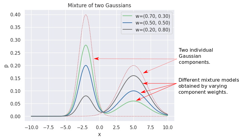
Different pdfs using a GMM
Let’s go back to the original question. In the figure below, we consider some data points on the x-axis (shown with small vertical lines, known as a rugplot). The corresponding histogram is also shown. We try to approximate this target distribution with a GMM with 3 components, shown with the red dashed lines. The black solid line shows the final pdf obtained using appropriate weights (not shown), which you’d note, is quite close to the histogram. This is a GMM in action.
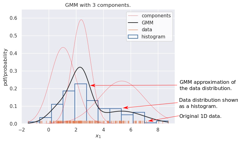
Approximating a data dsitribution with a GMM
Here we won’t discuss how we find the number of components, or their parameters, or their weights - the first one is a hyperparameter (so you either determine it based on some task specific metric or use a heuristic such as AIC), and the latter are typically determined using a popular algorithm known as Expectation Maximization (EM), for which we use scikit’s implementation. Here’s an interesting bit of trivia: the EM algorithm was proposed in 1977, which was much after the first use of GMMs (which, as mentioned above, was in 1894)!
Interestingly, it is also possible to use an infinite number of components, but that’s again something we won’t cover here.
Sampling from a GMM
As a quick stopover, let’s ask ourselves the “inverse” question: how do we generate data from a GMM \(\sum_{i=1}^{K} \mathcal{N}(x;\mu_i, \sigma_i^2)\)? Think about the physical interpretation we discussed earlier; that’s going to be helpful now. To generate one data instance \(x\), we follow this two-step process:
- Use \(w_i\) as probabilities to pick a particular component \(i\).
- And then generate \(x \sim \mathcal{N}(\mu_i, \sigma_i^2)\).
Repeat the above steps till you have the required number of samples.
This ends up producing instances from the components in proportion to their weights. The following video shows this for a 2-component GMM. For sampling a point, first a component is chosen - this choice is temporarily highlighted in red. And then an instance is sampled - shown in blue. The black line shows the pdf of the GMM, but if you sampled enough instances and sketched its empirical distribution (using, say, a kdeplot), you’d get something very close to this pdf.
Multivariate Gaussians
Of course, GMMs can be extended to an arbitrary number of \(d\) dimensions, i.e., when \(x \in \mathbb{R}^d\). We augment the notation to denote such a pdf as \(p(x_1, x_2, .., x_d)\), where \(x_i\) denotes the \(i^{th}\) dimension of a data instance \(x\). The GMM now is composed of multivariate Gaussians \(\mathcal{N}(\mu, \Sigma)\). The symbol for the mean is still \(\mu\), but now \(\mu \in \mathbb{R}^d\). Instead of the variance, we have a covariance matrix, where \(\Sigma_{i,j}\) - the entry at the \((i,j)\) index - denotes the covariance between values of \(x_i\) and \(x_j\) across the dataset. Since covariance doesn’t depend on the order of variables, \(\Sigma_{i,j}=\Sigma_{j, i}\) and thus \(\Sigma \in \mathbb{R}^{d \times d}\) is a symmetric matrix.
And yes, unfortunately the symbol for summation \(\sum\), which is \sum in LaTeX, and the covariance matrix \(\Sigma\) - \Sigma - look very similar. I was tempted to use a different symbol for the latter, but then I realized it might just be better to bite the bullet and get used to the common notation.
The GMM operates just the same, i.e., for \(x \in \mathbb{R}^d\), we have:
\[\begin{aligned} p(x) = \sum_{i=1}^{K} w_i \mathcal{N}(x;\mu_i, \Sigma_i) \end{aligned}\]Contour Plots
We want to be able to visualize these high-dimensional GMMs.
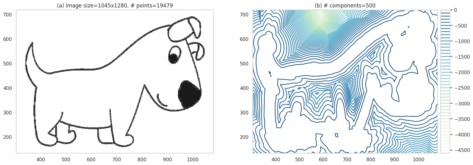
In general, faithful visualization of high-dimensional structures is hard, but, fortunately, there is a well known technique applicable to two-dimensions: contour plots. In the figure below, (a) shows some data points in 2D. I have used a 2-component two-dimensional GMM to model this data. Instead of showing the pdf on a \(z\)-axis in a 3D plot, we calculate the values \(z=p(x_1, x_2)\) values at a whole lot of points in the input space, and then connect the points with identical \(z\) values. We might also color the lines formed by these connections, to indicate how high or low \(z\) is. These lines are knowns as contours and (b) shows such a contour plot.
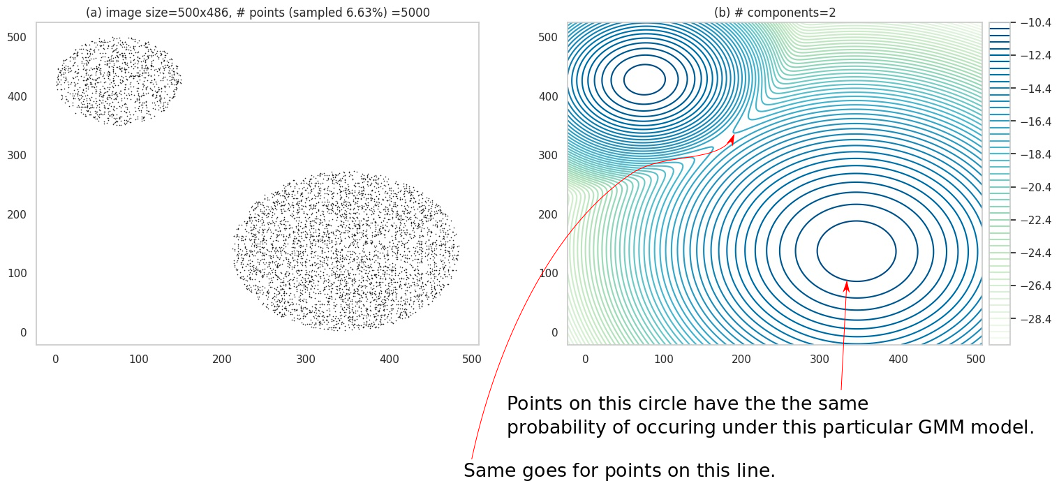
(a) shows a 2-D dataset. (b) shows the contour plot of 2-component GMM fit to the data.
Note the legend in (b) - it has negative numbers. This is because (b) actually shows contours for \(log\; p(x_1, x_2)\) - which is a common practice (partly because it leads to better visualization, and partly because the quantity \(log\; p\) itself shows up in the math quite a bit).
Some Properties
So far the only thing we have used the GMM for is to sample data. This is useful, but sometimes we want to use the model to answer specific questions about the data, e.g., what is the mean value of the data? We’ll briefly look at this aspect now.
Expectation
The expectation or the expected value of variable is its average value weighted by the probabilites of taking those values:
\[\begin{aligned} E_p[x] = \int_{-\infty}^{+\infty} x p(x) dx \end{aligned}\]The subscript \(p\) in \(E_p[x]\) denotes the distribution wrt which we assume \(x\) varies; we’ll drop this since its often clear from context. While the integral ranges from \({-\infty}\) to \({+\infty}\), it just indicates that we should account for all possible values \(x\) can take.
For a Normal distribution, \(E[x]\) is just its mean \(\mu\). We can use this fact to conveniently compute the expectation for a GMM:
\[\begin{aligned} E[x] &= \int_{-\infty}^{+\infty} x \Big( \sum_{i=1}^{K} w_i \mathcal{N}(x;\mu_i, \Sigma_i) \Big) dx \\ &= \int_{-\infty}^{+\infty} \Big( \sum_{i=1}^{K} w_i x \mathcal{N}(x;\mu_i, \Sigma_i) \Big) dx \\ &=\sum_{i=1}^{K} \Big( \int_{-\infty}^{+\infty} w_i x \mathcal{N}(x;\mu_i, \Sigma_i) dx \Big) \\ &=\sum_{i=1}^{K} \Big( w_i \int_{-\infty}^{+\infty} x \mathcal{N}(x;\mu_i, \Sigma_i) dx \Big) \\ &=\sum_{i=1}^{K} w_i \mu_i \\ \end{aligned}\]Conditional Distributions
It’s often useful to talk about the behavior of certain variables while holding other variables constant. For example, in a dataset comprised of Age and Income of people, you might want to know how Income varies for 25 year olds. You’re technically looking for a conditional distribution: the distribution of certain variables like Income, given a condition such as Age=25 over the other variables.
The density obtained after conditioning on a certain subset of dimensions, e.g., \(x_{d-2}=a,x_{d-1}=b,x_{d}=c\), is written as (note the | character):
What do such conditonal distrbutions look for the Gaussian? Consider a simple case of two variables \(x_1, x_2\), and conditioning on \(x_1\):
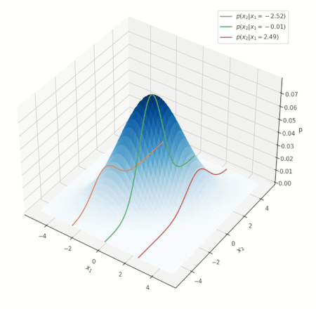
Conditional distribution for a Gaussian.
Look at the various conditional distributions \(p(x_2 \vert x_1)\), for different \(x_1\). In the figure, this is equivalent to “slicing” through the Gaussian at specific values of \(x_1\), as shown by the three solid lines. Do these distributions/solid lines suspiciously look like Gaussians? They are! The conditional distributions of a Gaussian are also Gaussian. We wouldn’t go into proving this interesting property, but its important to know it is true.
NOTE: the above animation only serves to provide a good mental model and doesn’t present the whole picture. You can delve deeper into nuances this visualization misses here, but if this is your first encounter with the notion, you can skip it for now.
But what does this say about GMMs? Because of the above property, the conditional distribution for a GMM is also a GMM. This new GMM has different weights and components. You can find a derivation here. This insight will be helpful when we deal with color images.
OK, our short stop is over … on to actual problem-solving!
Why Images?
If GMMs are about modeling data, how do images fit in? Let’s take the example of black-and-white images: you can think of every single black pixel as a data point existing at its location. Look at the image below - the pixels that make up the shape of the dog are the data we will use to fit our GMM.
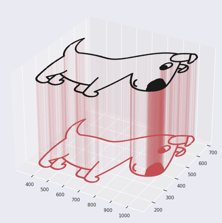
GMMs. Original image source: pixabay.com
For color images things get a bit complicated - but not that much, and we’ll find a way to deal with it later.
Black and White Images
Let’s start with black-and-white images since they are easier to model. Our training data for the GMM is essentally the collection of all coordinates where we have black pixels, as shown below:
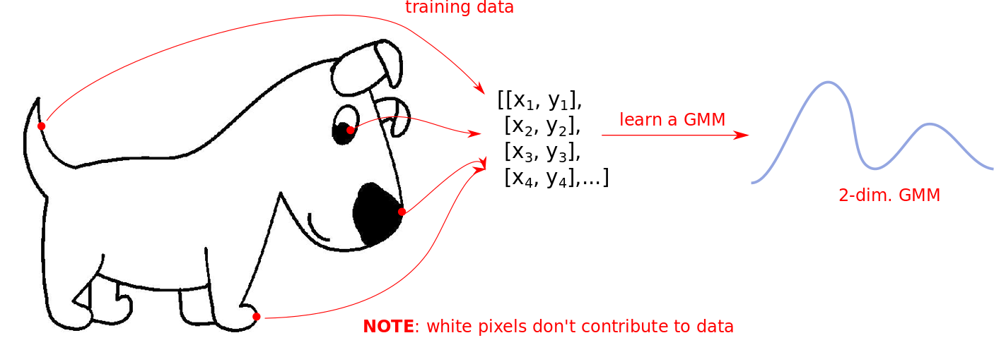
The white regions in the above image DO NOT contribute to the dataset. The learned GMM only knows where data is present. In this case the components are 2-dimensional Gaussians since we are only modeling coordinates in a 2D plane.
Sampling
We now generate our first images <drum roll>! The recipe is simple:
- We create our training data as shown above, and fit a 2-dimensional GMM. We set the number of components \(K=500\). No particular reason, I just picked an arbitrary high number.
- Create a contour plot for the GMM - which gives us our first fancy image. Art!
Going to back to our previous example, we have:
Contour plot.
We can also generate the image by sampling from the GMM. We have seen how to sample earlier - its pretty much the same now, except we have more components and each point we sample has 2 dimensions, and thus can be placed on a plane.
We’ll sample multiple points \((x_1, x_2)\), and at these locations, we place a blue pixel. We show what these samples look like for different sample sizes in (a) and (b), for ~20k and ~40k points respectively.
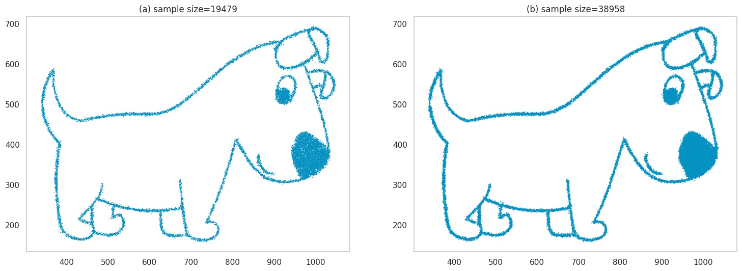
Images generated by sampling.
OK, lets dial up the complexity a bit. We’ll use an image of a butterfly this time, that has more details. Plots (a) and (b) are the same as before, but we increase the sample size in (c) and (d) to ~50k and ~100k respectively to handle the increased image details.
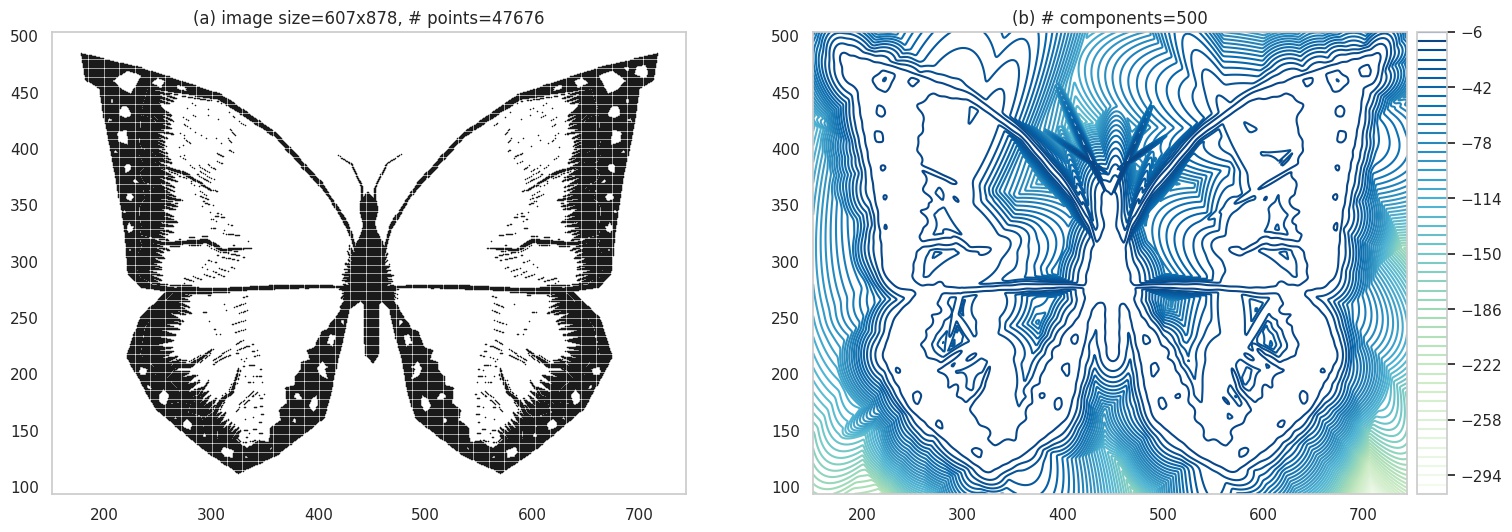
Contour plot of a very psychedelic butterfly. Original image source: pixabay.com.
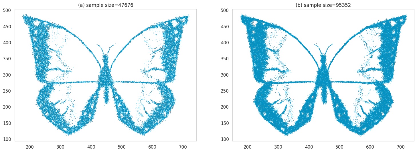
Images generated by sampling.
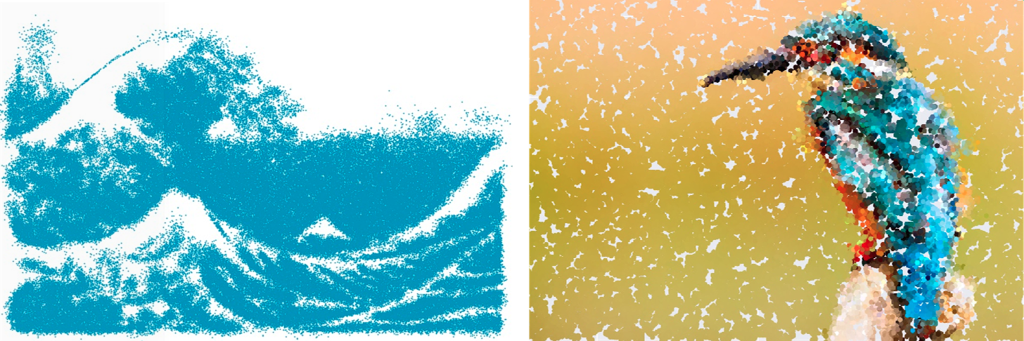
Next, we will make the image even harder to learn - which effectively means the image has a lot of detail, which makes it computationally challenging for the model to learn. We’ll use an image of the famous print Great Wave off Kanagawa. Here, you can see the outputs have lost quite a bit of detail.
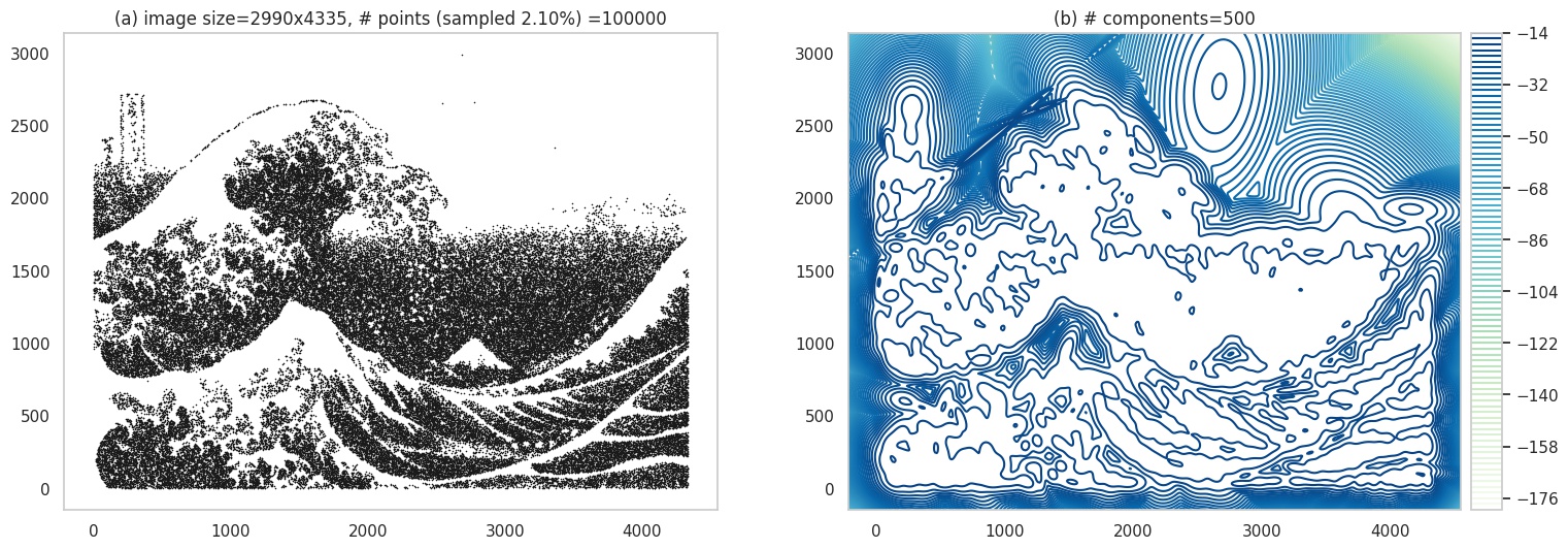
Contour plot. Original image source: wikipedia.com.
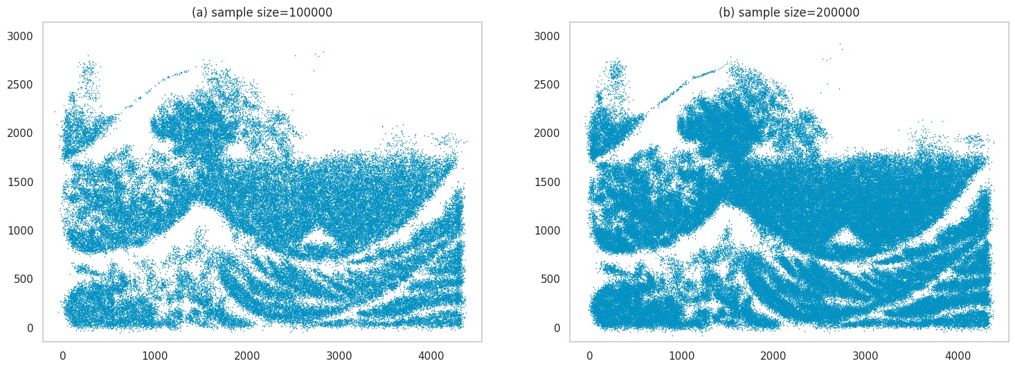
Images generated by sampling.
These look cool - but there is another way to use our GMMs to generate these images. Let’s look at it next.
Grid-plotting
Instead of sampling from the GMM, we can go over a grid of coordinates \((x, y)\) in the input space, and color the pixel at the location based on the value for \(p(x, y)\). The below image shows the process. The blank circles show locations yet to be colored.
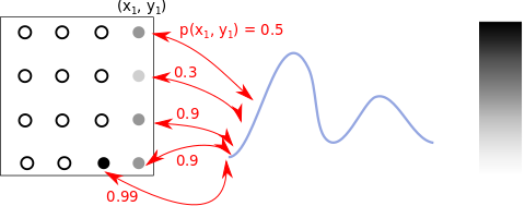
Color positions based on p(x,y) values.
The above image simplifies one detail: \(p(x, y)\) values are pdf values, so do not have an upper-bound (but our grayscale ranges within [0,1]). We collect all these values for our grid of points, scale them to lie in the range [0,1] before we plot our image.
Let’s start with the image of the dog. We see its almost perfectly recovered! We probably expect this by now given its a simple sketch.
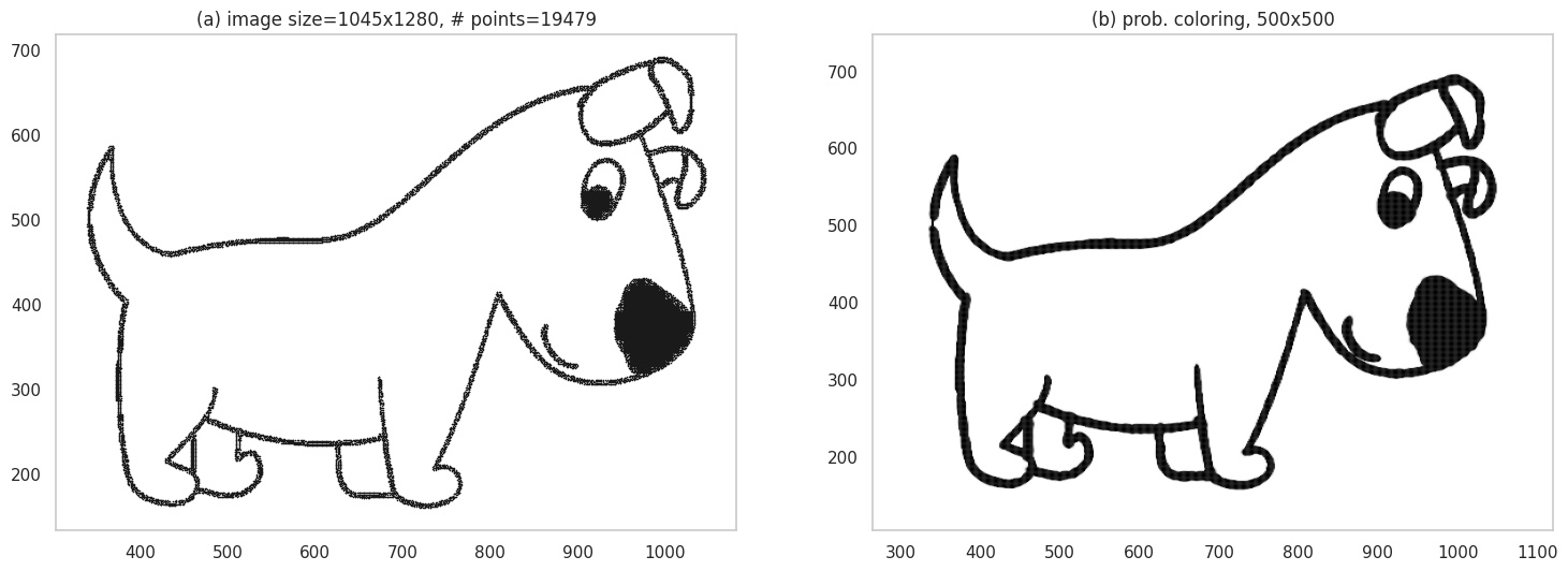
Grid plot.
However, notice the width of the lines. Do they seem thicker? That’s because pixels in the close neighborhood of the actual sketch lines also end up getting a black-ish color - afterall, we are using a probabilistic model. As details in an image grow, you will see more of this effect. Below, we have the butterfly image - you can actually see smudging near the borders, making it look like a charcoal sketch.
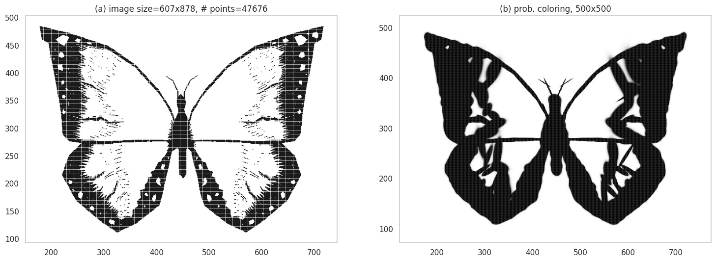
Grid plot.
The waves image is tricky because of the high amount of detail - and its not surprising that we obtain a heavily smudged image, to the point it looks like a blob!:
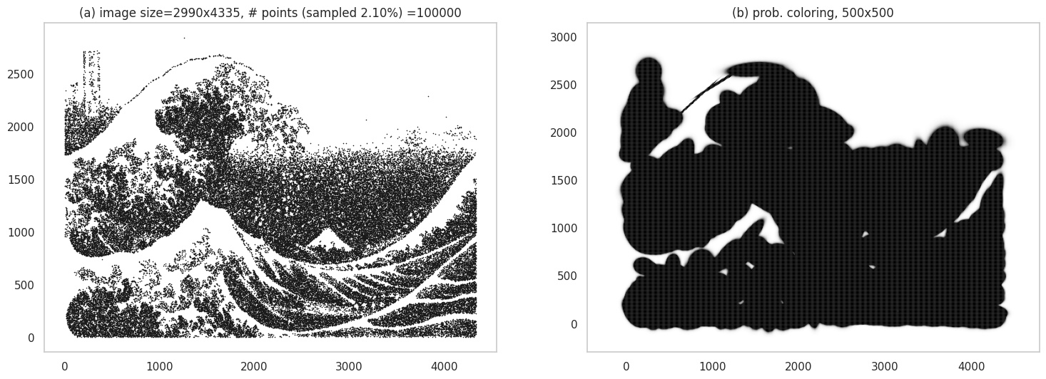
Grid plot.
But fear not - we have another trick up our collective sleeves!
Custom Mapping for Grid Plots
How do we do better? A simple hack is to change the mapping of probabilities to color values, so that the numerous points with low probabilities are visibly not dark. We can replace the implicit linear mapping we’ve been using with a bespoke non-linear mapping that achieves this outcome - in the figure below, (a) shows this with a piecewise linear function, where the dashed orange line is the default linear mapping (shown for reference). The x-axis shows the scaled pdf values of pixels, and they y-axis shows the score they are mapped to on the gray colormap, which ranges between [0, 255]. Our version allows for very dark colors for only relatively high scaled pdf values.
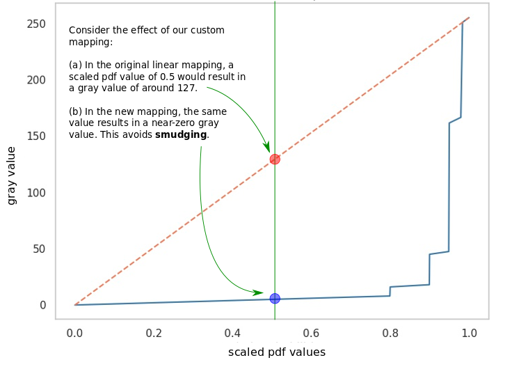
Custom mapping between probabilities and intensity of black color.
Below we compare the linear mapping in (a) to our custom mapping in (b). In (b) we do end up recovering some details; you can actually see Mt. Fuji now! We can also explore playing with the number of components, point sizes, alpha values etc.
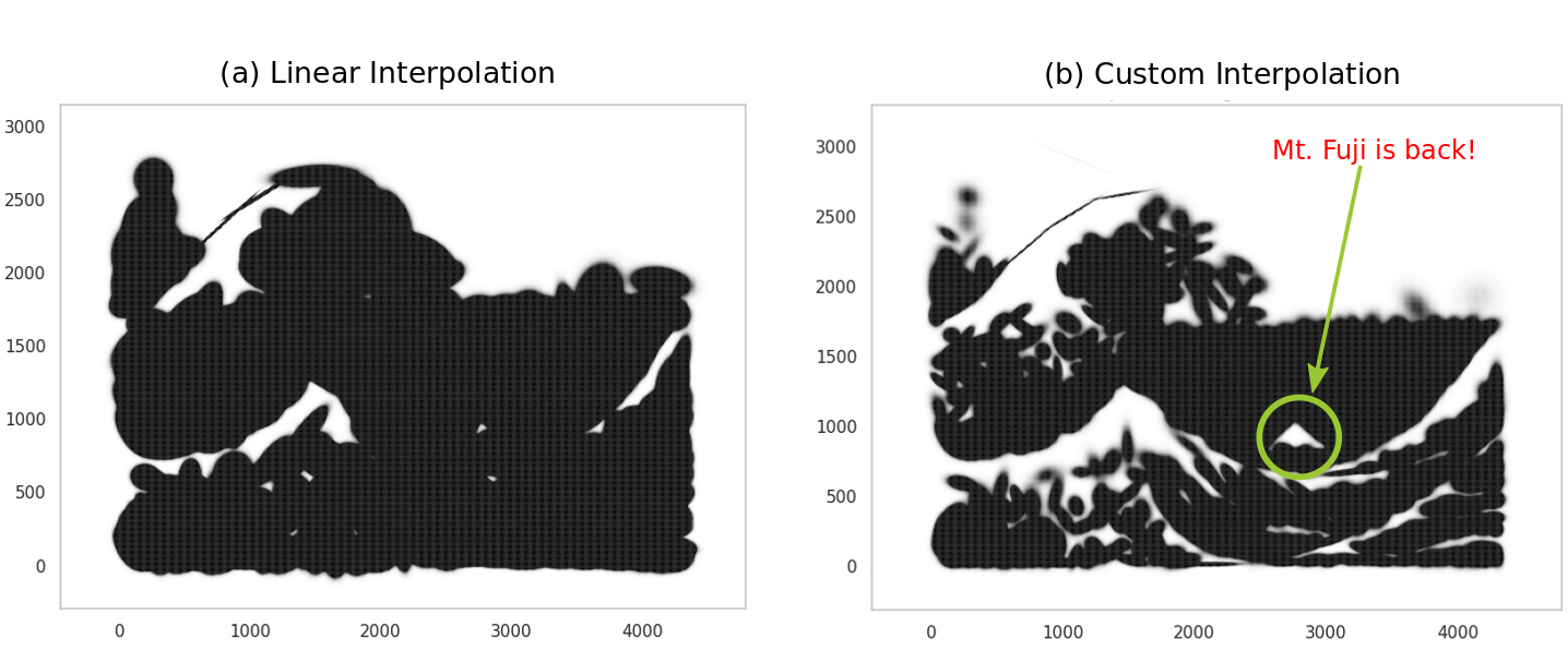
With custom mapping.
There are probably numerous ways to tweak the steps in this section to make the images more aesthetic (and it can get quite addictive!), but lets stop for now and instead direct our attention to modeling color images.
Color Images
Finally, the pièce de résistance!
The challenge with color images is we can’t just fit a model to the locations of certain pixels: ALL locations are important, because they all have colors. Additionally, we also need to model the actual colors - in the previous case, this is not something we explicitly modeled.
Let’s proceed by breaking down the problem. We can think of every location in the image as having 3 colors: red (R), green (G), blue (B). These are also known as channels. In the image below, the RGB channels for a color image are shown.

The original image is at the top left; the remaining images show the red, green and blue channels. Original image source: pixabay.com.
We need to model these RGB values at each location. For this we use a 5-dimensional GMM, where the variables are the \(x, y\) coordinates followed by the \(r, g, b\) values present at that coordinate. The following image shows how the training data is created - a notable difference from the black-and-white case is that all locations are used.
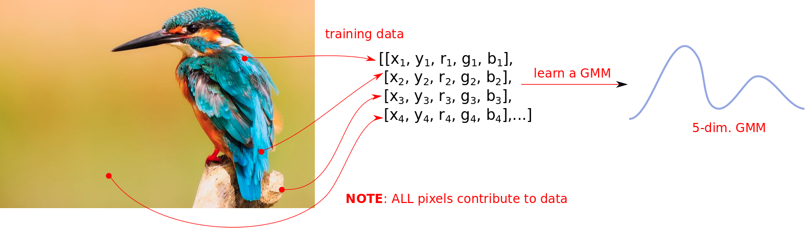
In constrast to the black-and-white case, all pixels contribute to the data.
These GMMs are going to be larger because of both (a) a higher number of dimensions, and (b) a lot more points to model. I am also going to use a larger number of components since there is more information to be learned.
Sampling
So we have our 5-dimensional GMM now (trained with \(K=1000\) components this time). We can generate our first set of images by sampling as before: sample a point \((x, y, r, g, b)\), and color the pixel at location \((x,y)\) with the colors \((r,g,b)\). A minor practical detail here is that you would need to clip the \(r,g,b\) sampled values to lie in the right range - because the GMM, not knowing these are colors, might generate values beyond the valid range of [0, 255].
But it works. Behold!
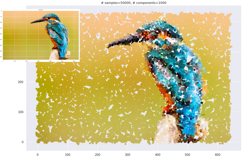
Original image source: pixabay.com
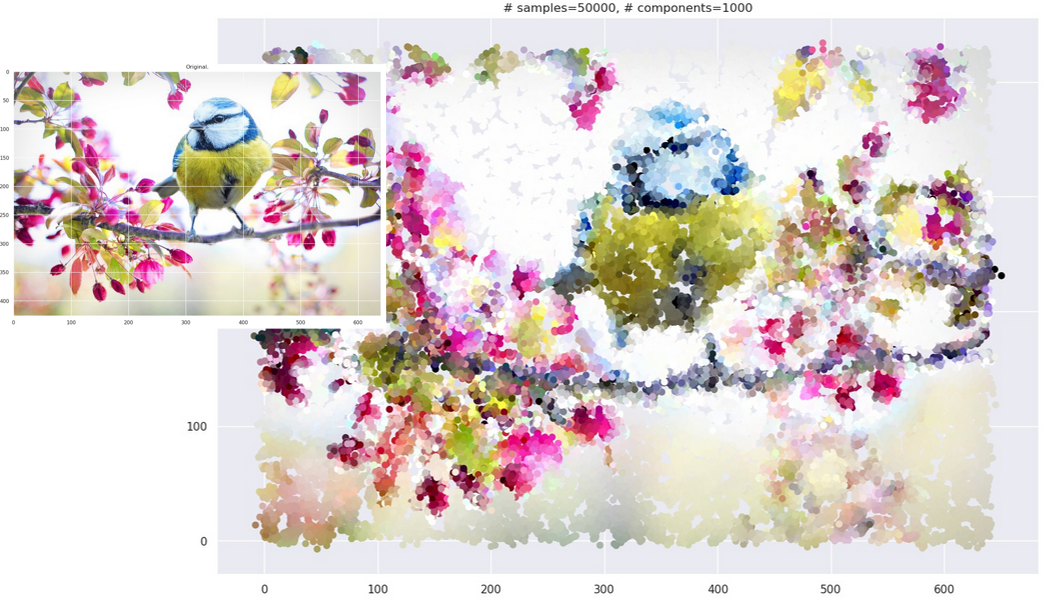
Original image source: pixabay.com
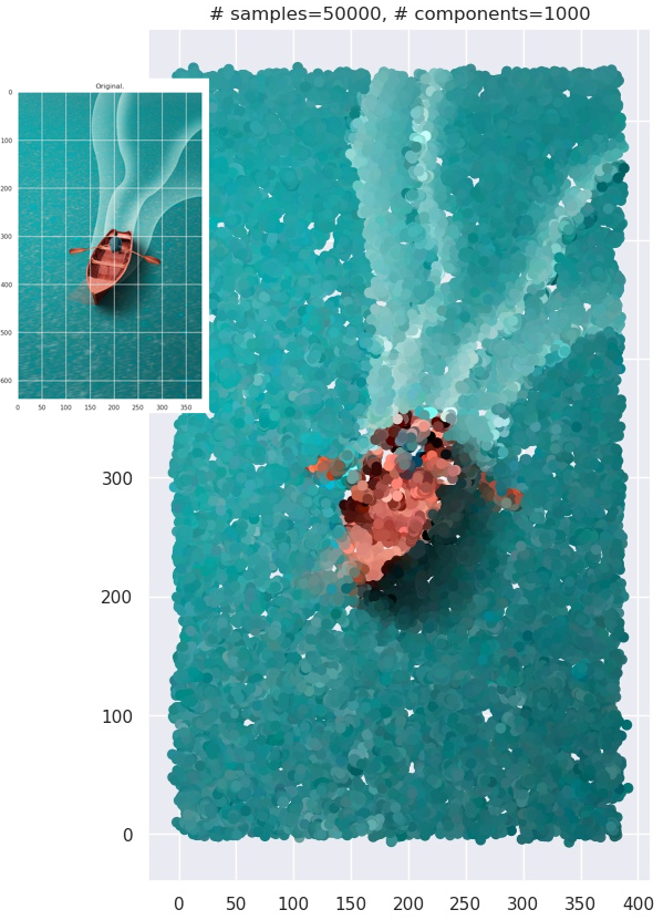
Original image source: pixabay.com
Grid-plotting
Remember we were able to generate images earlier by plotting points on a grid? How do we do that here? Well, the answer is a little complicated but doable.
Here’s the challenge: at a particular coordinate \((x_1, y_1)\), you can ask your GMM for a conditional distribution: \(p(r,g,b \vert x=x_1, y=y_1)\). Yes, you get a full-blown different GMM over \(r,g,b\) values at every coordinate (because, like we discussed, the conditional of a GMM is also a GMM). How do we color a location with a distribution? - well, here I just use its mean value. Effectively, given a specific coordinate \((x_1, y_1)\), I calculate the mean values for the \((r,g,b)\) tuple:
\[\begin{aligned} E[r, g, b \vert x=x_1, y=y_1] \end{aligned}\]The below schematic shows this is what that looks like:
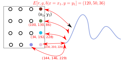
Grid plot strategy.
This is computationally more expensive than the black-and-white case. When you use the strategy on actual images, you end up with images with “smudgy brush strokes” - something you may have noticed with other AI-generated art. But the results are not bad at all!
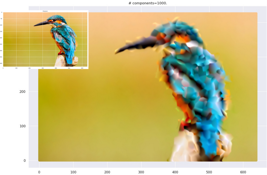
Grid plot.
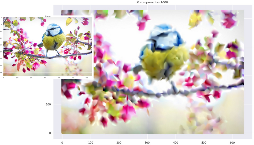
Grid plot.
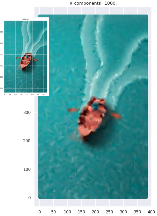
Grid plot.
Notes
A list of miscellaneous points that I kept out of the main article to avoid cluttering.
- I fixed a lot of the GMM parameters to some sweet-spot between the training being not memory intensive and the outputs being aesthetically pleasing. Of course, lots of tweaking possible here.
- Can we use discriminative classifiers? Yes - as an example, for the black-and-white case, given a location \((x, y)\) you could predict a label in \(\{0, 1\}\) for white and black colored pixels respectively. Here’s an example where I used LightGBM as the classifier:
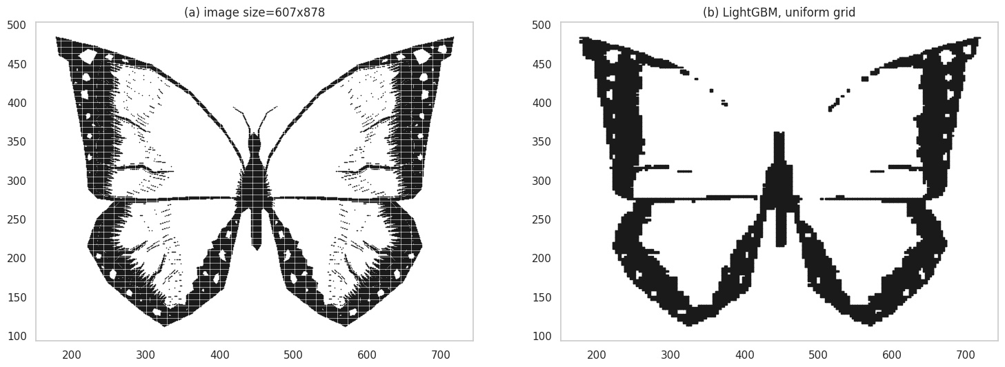
Grid plot using a discriminative classifier.
- Images were created using: matplotlib, seaborn, Inkscape, ezgif, gifsicle, Shutter.
- Thanks to pixabay for making their images available royalty-free. Specifically, I used these images:
- I extracted black-and-white images out of the original color images of the Dog and Butterfly.
- The images in the color section are from here: Kingfisher, Springbird, Boat in ocean.
- As mentioned earlier, the image of “The Great Wave off Kanagawa” is from wikipedia.
- For various properties of the Gaussian, Bishop’s book “Pattern Recognition and Machine Learning” is a commonly cited reference (PDF). Properties of Gaussians can be found in Section 2.3 and GMMs are discussed in Section 9.2.
This was a fun article to write - so much fun that I kept playing around with various parameter settings and broader creative ideas (sadly, mostly unfinished) to the point that this has been languishing as a draft for more than a year now! GMMs themselves are not used as much anymore, but I think of them as a good place to start if you want to understand how to use distributions for practical problems. GMMs aside, it is good to be familiar with the properties of Gaussians since they keep cropping up in various places such as Probabilistic Circuits, Gaussian Processes, Bayesian Optimization and Variational Autoencoders.