Bayesian Optimization, Part 1: Key Ideas, Gaussian Processes
The real reason I like Bayesian Optimization: lots of pretty pictures!
If I wanted to sell you on the idea of Bayesian Optimization (BayesOpt), I’d just list some of its applications:
- Hyperparameter Optimization (HPO) (Turner et al., 2021).
- Neural Architecture Search (NAS) (White et al., 2021).
- Prompt Optimization for LLMs (Opsahl-Ong et al., 2024).
- Molecule discovery (Gómez-Bombarelli et al., 2018).
- Liquid chromatography (Boelrijk et al., 2023).
- Creating low-carbon concrete (Ament et al., 2023).
- Plasma control in nuclear fusion (Mehta et al., 2022).
- Parameter tuning for lasers (Kirschner et al., 2019-11)
My own usage has been tamer, but also varied: I’ve used it to (a) learn distributions (Ghose & Ravindran, 2020; Ghose & Ravindran, 2019), and (b) tune SHAP model explanations to identify informative training instances (Nguyen & Ghose, 2023).
Why is BayesOpt everywhere? Because the problems it solves are everywhere. It provides tools to optimize a noisy and expensive black-box function:
- Black-box: Given an input, you can only query your function for an output; you don’t have any other information such as its gradients. Sometimes you mightn’t even have a mathematical form for it.
- Expensive: You need to be mindful about how many times you query this function because every query is expensive wrt time, compute cost or effort.
- Noisy: The same input might produce slightly different outputs.
The lack of function information is in contrast to the plethora of Gradient Descent variants that are fueling the Deep Learning revolution. But if you think about it, this is a very practical problem. For example, you want to optimize various small and large processes in a factory to increase throughput - what does a gradient even mean here?
I encountered the area in 2018, when, as part of my Ph.D., I’d run out of ways to maximize a certain function. And the area has only grown since then. If you’re interested, I’ve an introductory write-up of BayesOpt in my dissertation (Section 2.1) too, and Section 2.3 there talks about the general problem I wanted to solve. Much of the material here though comes from a talk I gave a while ago (slides).
OK, let’s get started. This is part-1 of a two-part series, where I intend to provide a detailed introduction to BayesOpt. I also introduce Gaussian Processes, and if you’re here just for that you can jump straight to this section. Here’s a layout for this part:
In part-2, I’ll talk about acquisition functions, learning resources, etc. As you can probably tell, this is going to be a long-ish series; settle in with ample amounts of coffee!
The Problem
At its heart the family of BayesOpt techniques still strive to solve an optimization problem:
\[\require{color} \begin{aligned} \arg \max_{x \in \mathcal{X}} f(x) \end{aligned}\]Here, we are maximizing (or minimizing) wrt \(x\) whose values range over a domain \(\mathcal{X}\). Reiterating what we said before, BayesOpt is useful when \(f(x)\) possesses one or more of these properties:
- Its mathematical expression is unavailable to us or it is not differentiable.
- It is expensive to evaluate.
- Evaluations are noisy, i.e., for the same input \(x\) you might obtain slightly different values of \(f(x)\).
These are very practical challenges. To ground them, I’ll use the (personally appealing) example of baking a perfect chocolate chip cookie (Solnik et al., 2017).
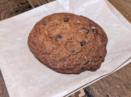
This is a good chocolate chip cookie! Barefoot, Campbell, CA if you're in the area!
The problem is: find a recipe, i.e., amount of flour, sugar, baking temperature and time, etc., for baking cookies that is optimal wrt taste. Taste assessment is made by multiple human raters. The objective function \(f\) is the assessment (averaged, if there are multiple human raters) given the input vector \(x\) of various cookie ingredients, e.g., quantity of flour, amount of chocolate chips, and cooking conditions such as oven temperature and time to bake. In other words, \(x\) encodes the recipe.
Why is this a good use case for BayesOpt?
- \(f(x)\) is not available for us to inspect (forget differentiability) - it exists in the heads of the human raters. But it can be invoked: ask people to rate cookies.
- To evaluate \(f(x)\), you need cookies baked according to the recipe \(x\). Baking a batch of cookies and distributing them for assessment consumes time (order of hours or days) and effort, making it expensive to evaluate \(f(x)\). The only upside is an unending supply of cookies would probably make your raters happy!
- Does a person rate the same cookie in the same way in a blind test? Mostly yes, but sometimes, may be not. Also, external factors such as humidity might affect the taste for the same \(x\). Safe to assume \(f(x)\) is noisy.
One way to optimize \(f(x)\) is to create the most promising recipe based on a thorough examination of the history of recipes and assessments. Loosely speaking, you tease out parts of past recipes that worked or didn’t, and use that knowledge to assemble a new recipe. Bake a batch of cookies based on it and have it evaluated by the human raters. Add the current recipe and assessment to your history, and repeat. BayesOpt formalizes this idea.
Of course, as you might suspect, baking cookies is not all this is good for ;-). To consider a couple of practical cases:
-
Hyperparameter Optimization (HPO) is probably the flagship use-case of BayesOpt (Turner et al., 2021). We want to increase the predictive accuracy of a model \(f\), by tuning its hyperparams. Note the apt prerequisites:
- \(f\) is effectively black-box if we want our solution to be generic, i.e., it should be usable as much for Decision Trees as for Neural Networks.
- It is computationally expensive to evaluate (since evaluating \(f\) for a hyperparam setting would require us to retrain the model).
- It can also be noisy, e.g., randomly initialized learning like with gradient descent.
-
Prompt optimization for LLMs may be thought of as a specific type of HPO. The prompt is a hyperparameter that influences an LLM’s outputs. And all the constraints apply as well:
- If your LLM isn’t self-hosted, i.e., you’re using an OpenAI or Anthropic model, then it is a black-box.
- Iterating over prompts to find an optimal one can be expensive - wrt time and cost.
- And finally, prompting is noisy, given the non-deterministic nature of LLMs.
Hence BayesOpt (Opsahl-Ong et al., 2024; Schneider et al., 2025). If you’re using DSPy’s MIPROv2 prompt optimizer, you’re using BayesOpt under the hood.
These kinds of problems are ubiquitous - and the preamble to this article listed diverse settings where BayesOpt crops up. Applications aside, BayesOpt itself is evolving, e.g., InfoBAX (Neiswanger et al., 2021) uses BayesOpt-like ideas to compute arbitrary function properties (as opposed to just extrema) in a sample-efficient manner, grey-box optimization (Astudillo & Frazier, 2022) relaxes the black-box setting to utilize additional information like gradients.
As for libraries, Hyperopt is a popular library that implements a specific form of BayesOpt known as the Tree-structured Parzen Estimator (TPE) (Bergstra et al., 2011). There are others such as BoTorch, Ray Tune, Syne Tune and Bayesian Optimization.

Key Ideas
So what makes BayesOpt tick? Recall that BayesOpt is an iterative process, i.e., at each iteration a specific \(x\) is proposed and \(f(x)\) is evaluated. Essentially, BayesOpt primarily performs these two steps:
- At a given iteration \(t\), you’ve the function evaluations \(f(x_1), f(x_2), ..., f(x_{t-1})\). You can fit a regression model to this history \(\mathcal{H}=\{(x_i, f(x_i))\}_{i=1}^{i=t-1}\) of \(t-1\) evaluated pairs \((x_i, f(x_i))\), to approximate the actual objective function over the entire input space \(x\in \mathcal{X}\). We will refer to this approximation as our surrogate model \(\hat{f}\).
Would any regression model do, e.g., Decision Trees, Neural Networks? Almost - but there is an additional property we require of our regressor, as we’ll shortly see. - Use \(\hat{f}\) as the function to optimize (instead of \(f\)) and propose a minima \(x_t\). Evaluate \(f(x_t)\), and if it isn’t satisfactory or you haven’t exhausted your optimization budget, you can add \(f(x_t)\) to the history \(\mathcal{H}\), refit \(\hat{f}\) on these \(t\) evaluations, and repeat these steps.
This is a simplified picture, and there are at least two important nuances:
- First, the surrogate model needs to have the property that for \(x\in \mathcal{X}\) where the exact value is not known, i.e., \(f(x)\) is not available in history \(\mathcal{H}\), we need to be aware of how uncertain is our guess \(\hat{f}(x)\).
- And second, in Step 2 above, we don’t always guess the minima based on the current \(\hat{f}\). Sometimes, we might choose to propose an \(x_t\) in the interest of exploration, i.e., in a region of \(\mathcal{X}\) where we haven’t evaluated \(f\) enough. This is the famous explore-exploit tradeoff you might’ve heard in the context of Reinforcement Learning; it applies to BayesOpt too. Given the current surrogate model \(\hat{f}\), that was fit on history \(\mathcal{H}\), the next point \(x_t\) on which we wish to acquire \(f(x_t)\) is provided by an acquisition function.
In fact, its the acquisition function that needs to know how uncertain \(\hat{f}\) is at various inputs, so it can judiciously make the explore-exploit trade-off.
Let’s visualize these ideas for maximization of a univariate function, i.e., \(\mathcal{X}\) is a line.
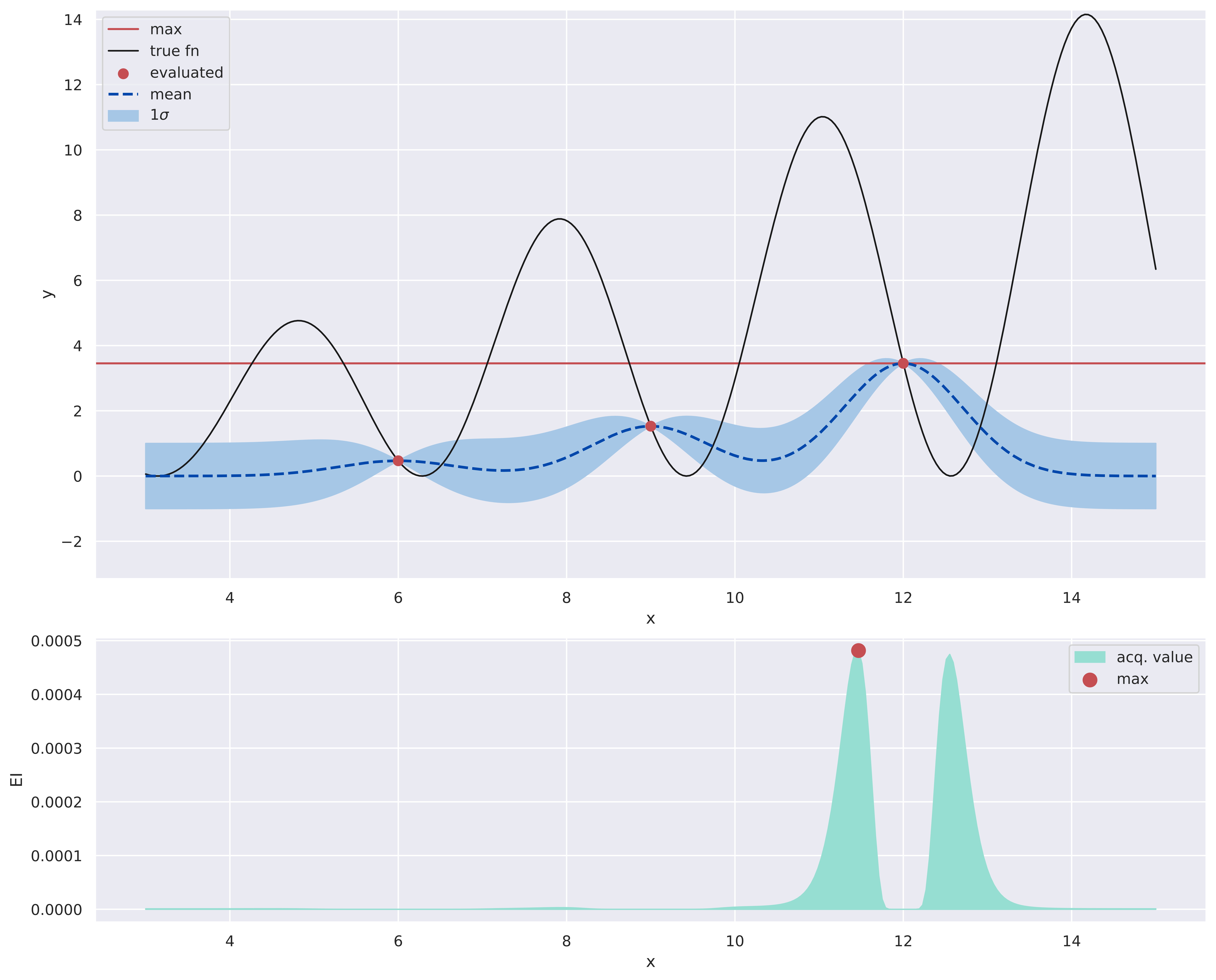
At an iteration of BayesOpt. The bottom plot shows the acquisition function values over the input space.
The image above show two plots stacked vertically. Start with the top plot, and note the legend there. This shows what things look like with BayesOpt at its \(4^{th}\) iteration. \(f\) is shown with a black solid line and red dots mark the \(3\) prior evaluations of \(f\). A surrogate model \(\hat{f}\) fitted to these dots is shown as a blue dashed line. Outside of the red dots, we’re uncertain of the precise values, and this is shown as an envelope of somewhat likely values, i.e., those that fall within one standard deviation (denoted as \(1\sigma\)) of our mean guess (the dashed blue line). We’ll discuss how to obtain these estimates in the next section, using Gaussian Processes. At the red dots, the envelopes disappear because there is no guesswork involved. The envelope balloons up as we move into regions away from the red dots. The current discovered max. is shown by the horizontal red line.
The bottom plot shows what the acquisition function looks like over \(\mathcal{X}\). We’ll see how its exactly calculated later (spoiler: there are many ways), but the red dot in this plot denotes the greatest acquisition value.
Lets move onto the \(5^{th}\) iteration, as shown below. Now we have evaluated \(f\) on \(x\) the acquisition function had suggested, and this recent evaluation is shown with a square box. This leads to a higher estimated maxima - horizontal red line. The other steps are repeated: \(\hat{f}\) is refit on this data with 4 points, which means its uncertainty envelopes are recomputed as well. Note how the envelope nearly disappears in the interval \(\sim [11.5, 12.25]\) because of two evaluations, i.e., red dots, in close proximity. We also re-calculate the acquisition values over \(\mathcal{X}\). Note that this time though, the acquisition function has a single hump - it seems reasonably sure about where the maxima lies.
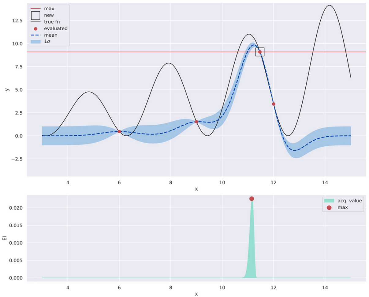
The next iteration. The square box shows the new evaluation based on the previous iteration.
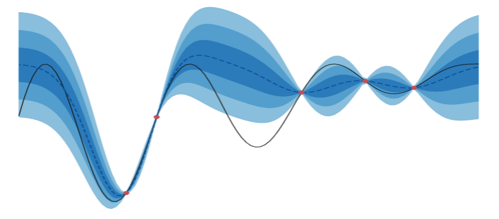
OK, now lets look at iterations 4, 5, 6 and 7 together - shown below.
Multiple iterations. Note the multiple high-density regions in the final acquisition value plot.
Notice something interesting? In the last iteration the acquisition function has grown less sure about where valuable points are located - lots of new green regions in the bottom plot. These kinds of “occassional discoveries” are a characteristic of BayesOpt: as newer evaluations become available, the acquisition function revises its notion of valuable locations. In fact, the amount of “fat” envelopes (the top plots) might increase as well, when regions of surprising behavior are discovered. Uncertainty decreases asymptotically but occasional fluctuations are to be expected.
For this example, I’d argue this is a good thing because we still haven’t discovered the actual global maxima. More exploration is great if we have the budget for it.
Unfortunately, this also makes it challenging to have a simple stopping criteria for BayesOpt (there are some, e.g., Makarova et al. (2022)), relative to, say, Gradient Descent (GD), where you might stop when the changes in the extrema become vanishingly small. Typically, you decide on an optimization budget, e.g., number of iterations \(T\), run it all the way through, and pick the best value (again, this is different from GD, where we might pick the last value).
Here’s the high-level BayesOpt algo summarized:
BayesOpt pseudocode.
The first point, i.e., at \(t=1\), is picked via random sampling here: \(\mathcal{U}(\mathcal{X})\) denotes uniform distribution over the domain \(\mathcal{X}\). You can begin with known prior evaluations too - this is helpful if you already know something about the function, e.g., where the maxima is likely to occur. Even prior known evaluations at arbitrary points help, as they save some exploration.
Look at Line 7 - we need to maximize for the acquisition value, and that also would require an optimizer. Here’s a question you might ask: did we just translate one optimization problem into another? What did we gain?
The answer is yes, there is another optimization problem we need to solve per iteration of BayesOpt, using what we refer to as the auxiliary optimizer. What we gain is this optimizer works with a tractable function - the surrogate model - instead of the original real-life function, which may or may not have a known form (like in the cookie example). The auxiliary optimization can be performed way quicker, relatively speaking, because the surrogate model exists on your computer, and you’re free to make as many calls to it as you like. It still needs to be fast, since this optimization needs to occur per iteration of BayesOpt.
Common choices for this optimizer are DIRECT and CMA-ES. We won’t go into details here, but this StackOverflow answer provides some information. There has been work to get rid of the auxiliary optimization (Wang et al., 2014).
NOTE:
This gives us another perspective on BayesOpt. There already exist black-box optimizers like DIRECT and CMA-ES. This aspect is not new. What’s different here is evaluating the objective function is expensive, and hence, inputs must be strategically picked so as to discover the optima in the minimum number of evaluations. In this view, BayesOpt provides a way to make other black-box optimizers sample efficient.
Comparison to Gradient Descent (GD)
Speaking of GD, let’s compare with it to better conceptually situate BayesOpt. On a minimization problem this time.
In the plots below, the top row shows BayesOpt and vanilla GD minimizing the same function, with the same starting point of \(0.3\), with a budget of \(T=100\) iterations. Points recently visited are both larger and darker. We use up all of \(T\) for BayesOpt but exit early for GD when the minima value doesn’t change appreciably.
The lower row shows Kernel Density Plots (KDE) visualizing where each optimizer (in the same column) spent its time.
BayesOpt compared with Gradient Descent.
We notice some interesting trends:
- GD (right column) spends most of its time getting to the closest local minima. The KDE plot shows this focus. The minima found is \(f(-0.04)=-0.1\). All recent points visited are concentrated around this minima, and the “shape” of the path is like a comet’s tail.
- BayesOpt (left column) is more “global” because of its exploration, and manages to find the global minima \(f(-2)=-9.81\). It doesn’t always find the global minima - just that here it does. The KDE plot shows that while BayesOpt also focuses on the global minima, its attention is fairly diffuse (look at the y-axes of both KDE plots). You can also see this from the scattered placement of the large red circles.
- As a follow-up to the previous point, the fact that BayesOpt spends much of its function evaluation budget closer to the minima, is a characteristic behavior of these methods. That’s to say, while it tries to model the whole input space, it allocates a larger budget to regions closer to the minima. This is the region that’s important to us. This is what you would expect from a smart search algorithm.
To be fair, you wouldn’t typically employ GD in this naive fashion - you would probably use momentum, use some kind of adaptive learning rate (this was fixed here) and perform multiple starts, but this example is more illustrative than practical.
At this point we have a view of BayesOpt at the, uh, cocktail party level. Hopefully, all of this has whetted your appetite to learn more about the two critical ingredients of BayesOpt: surrogate models and acquisition functions. We begin by looking at an example of the former.
Gaussian Processes (GP)
Recall we said that a good surrogate model needs to be able to quantify uncertainty well - in addition to being a good regressor. In my opinion, Gaussian Processes (GP) are almost the gold standard here. This is the reason why you tend to encounter GPs in conjunction with BayesOpt a lot. You could do BayesOpt without GPs, e.g., you can use Decision Trees (Kim & Choi, 2022) or Neural Networks (Snoek et al., 2015), but GPs and BayesOpt are a match made in heaven.
The topic of GPs is interesting and vast enough to merit its own blog post, but we’ll try to cover the relevant bits here.
Intuition
OK, let’s consider the regression angle. You have a bunch of points \((x_i, y_i), i=1...N\) where \(y_i \in \mathbb{R}\), to which you want to fit a function. But when you predict, now that we want to explicitly talk about uncertainties, you don’t want to predict one value for an input.
See (a) below - which is how we typically think about prediction - one input leads to one output only. A line through such outputs represents our model for the function. In (b), we show how predictions might look like when we are not sure yet of what we’ve learned; many values per input. Of course, we might not think all points are equally likely - shown in (c). Many outputs also implies we are effectively predicting many functions - every line that connects some output for each input is a possible function. We can also assign a probability to these function predictions by considering the confidences of the individual points they connect - see (d).
That GPs enable (c) and (d) is a good mental model to have. Let’s start getting into details.
Normally, you would posit a function \(f(x;\theta)\) with parameters \(\theta\), e.g., coefficients in Logistic Regression or weights in a Neural Network, and learn \(\theta\) that best explains the data. This is a parametric model, since \(f\)’s behavior depends on the parameters \(\theta\). Once you have learned \(\theta\), you can discard your training data \(\{(x_i, y_i)\}_{i=1}^N\). Importantly, these parameters decide the overall shape of your function.
GPs though, ask you to assume a certain smoothness in the function; which, roughly speaking, is how similar do you want \(y_i\) and \(y_j\) to be given similar \(x_i\) and \(x_j\). So instead of parameterizing the shape of the overall function, you try to define how input similarities dictate output similarities. This is a very different philosophy (something that Support Vector Machines also use), but quite natural. Consider the following function values:
- \(\;\) \(f(1) = 10\)
- \(\;\) \(f(2) = 40\)
- \(\;\) \(f(3) = 90\)
- \(\;\) \(f(4) = 160\)
If I now wonder about the value at \(3.1\), wouldn’t it make sense to guess that \(f(3.1) \approx 90\)? This is our natural sense of smoothness at work. In a way, GPs assemble the overall function from smaller function pieces where each piece honors some notion of local similarity that we define.
How do we operationalize this? Let’s step back for a bit, recall that we also want good uncertainties, and see if we can get both these properties in one shot. This might seem out of the left field but consider the Gaussian distribution \(\mathcal{N}(\mu, \Sigma)\) for a while (it’ll make sense in a while, promise). As a refresher, for a distribution over two variables, for the following covariance matrix:
\[\Sigma=\begin{bmatrix} \Sigma_{11} & \Sigma_{12}\\ \Sigma_{21} & \Sigma_{22} \end{bmatrix}\]we have:
- \(\Sigma_{11}\) and \(\Sigma_{22}\) are the individual variances of the random variables (which I’ll refer to as \(Y_1\) and \(Y_2\) - for reasons to be clear soon).
- \(\Sigma_{12}\) is the covariance between the two variables and signifies what values we might expect of one given the other. A positive value indicates high \(Y_1\) values signal high \(Y_2\) values; higher the \(\Sigma_{12}\), greater is this correlation. And vice-versa, for a negative value. This is a symmetric quantity, i.e., \(\Sigma_{12}=\Sigma_{21}\).
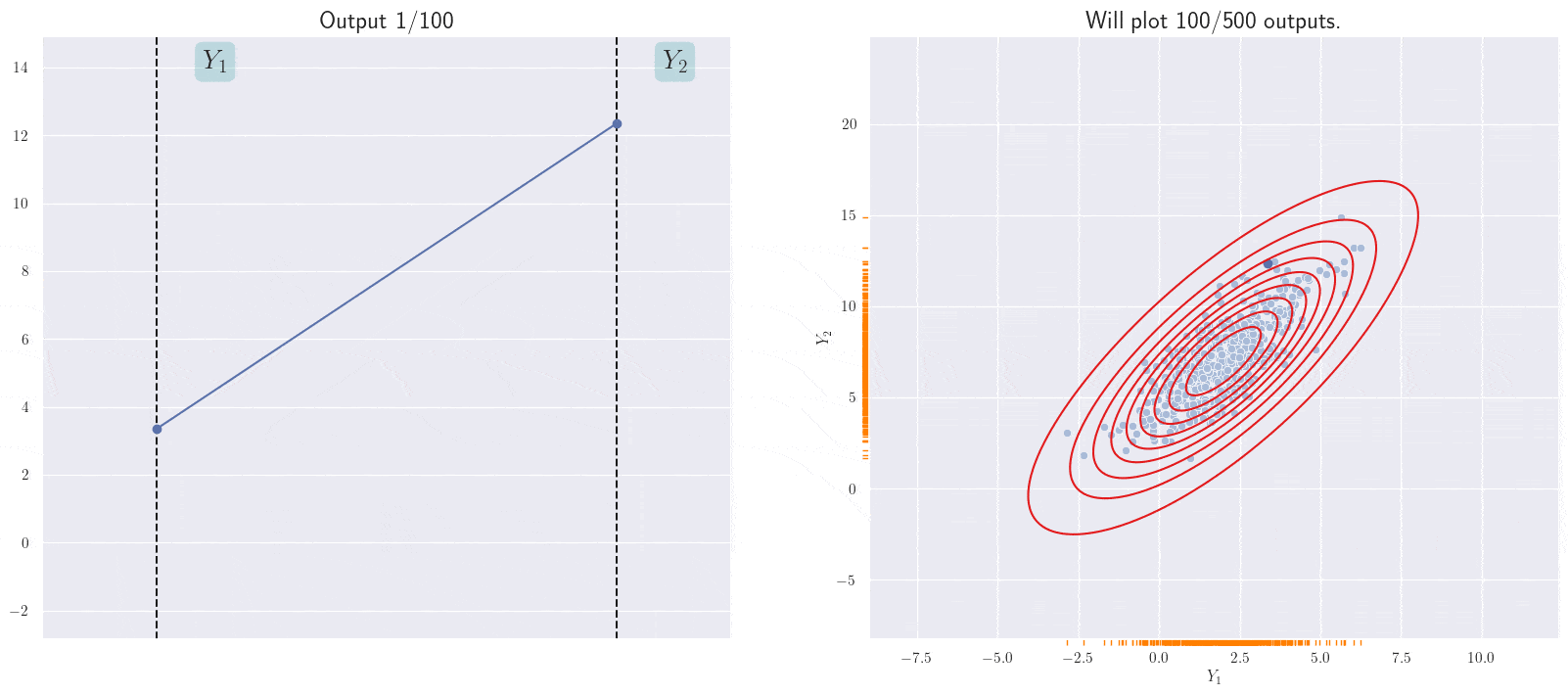
The plots below show some examples, with differing covariances (shown in the legend).
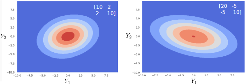
Effect of the covariance matrix.
Consider the first plot. The “forward slant” of the Gaussian exists because \(\Sigma_{12}=\Sigma_{21}=2\), and thus \(Y_1\) and \(Y_2\) are positively correlated. As possible values for \(Y_1\) increase (going from left to right), possible values \(Y_2\) also increase (goes from bottom to top).
Now, here’s an outlandish idea: what if we let the Gaussian random variable \(Y_i\) represent all possible outputs for \(x_i\)? Wait, why is there more than one output? Because we are explicitly modeling uncertainty in our knowledge of the function; which is to say, \(Y_i\) can take on a range of different values given our current state of knowledge. But the situation is not direly hopeless: we have some idea about the relative likelihood of these values of \(Y_i\). So we might be able to say things like “Given input \(x_i\), \(Y_i=2\) is more likely than \(Y_i=3\), but not as likely as \(Y_i=1\).”. This may be expressed as a distribution. Here’s what that might look like for \(Y_1\) (the rugplot, i.e., vertical bars shows the values, and the blue line shows their density):
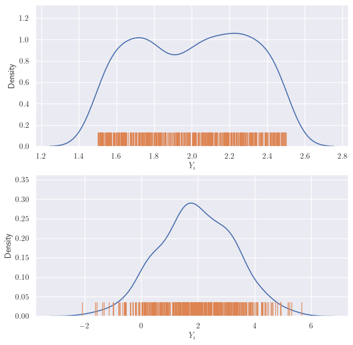
Two possible distributions of output for the same input.
We will assume that our uncertainty distribution may be expressed as a Gaussian - like in the second plot above. This is not unreasonable - you probably have a certain value (or a set of them in a small neighborhood) that you think are likely - this is the region around the mean of the Gaussian. The values for any \(i\) maybe expressed similarly (of course, with different Gaussians).
OK, now consider two outputs \(Y_1\) and \(Y_2\). They each have their Gaussians, right? But if \(x_1\) and \(x_2\) are close together, the output values cannot differ that much (remember: smoothness), even accounting for their uncertainties. What might these, somewhat coupled, values look like? I am going to place the values of \(Y_1\) and \(Y_2\) on the two axes of a 2D plot. And we get something like this:
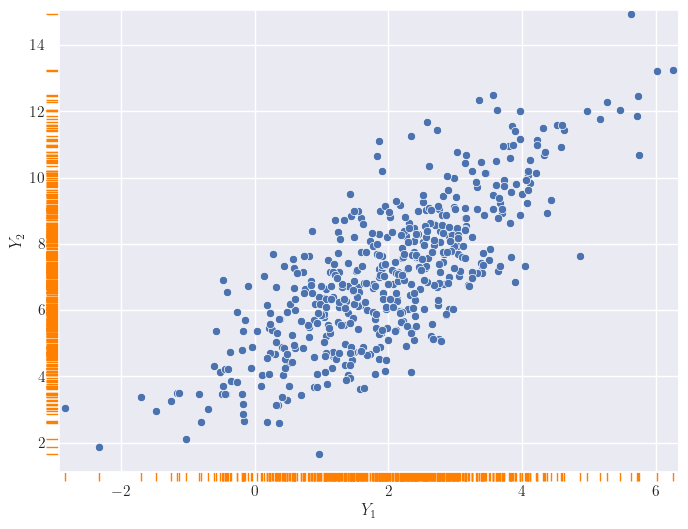
Visualization of two output distributions.
You might now think of the two outputs \(Y_1\) and \(Y_2\) as jointly following a bivariate, i.e., two-dimensional, distribution. Do you see where this is headed? No? Let me add some contours.
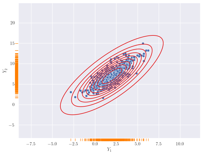
Visualization of two output distributions, with contours.
A 2D Gaussian! We have seen these before! It looks like if we express uncertainties in outputs for a given input as an 1D Gaussian, the joint distribution across outputs turns out to be a high-dimensional Gaussian. Actually, as we shall see in the next section, we just assume the latter and the former is a happy consequence of that.
And, since the coupling in the joint Gaussian distribution is controlled by the covariance matrix, we allow similarities in inputs decide its entries. Specifically, if \(k(x_i, x_j)\) denotes the similarity between \(x_i\) and \(x_j\), we let \(\Sigma_{ij} = k(x_i, x_j)\). Controlling the covariance matrix is a great way to regulate the variation in one output wrt another, and letting input similarities decide entries in this matrix works out perfectly for us: it gives us a precise way to enforce smoothness.
Can we visualize more than two output distributions? This is doable with a different visualization (I saw this here first): we’ll stack lines representing \(Y_i\)s next to each other, and for every set of values sampled from their joint distribution, we’ll draw a line through them. Let’s see what the above plot might look like in this form:
A different representation of the joint distribution.
The line currently shown corresponds to the current sample from the joint 2D Gaussian. Note the positive slope of the annimated line; this is because of the positive correlation between the \(Y_i\)s in the joint Gaussian.
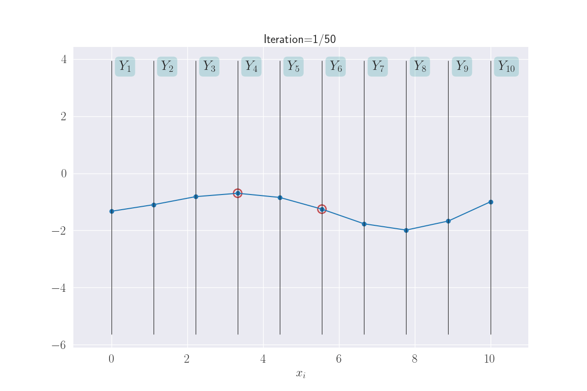
This gives us a way to visualize the behavior of more than just two \(Y_i\)s. And we’ll do exactly that next. But with a new twist: we’ll allow the gap between the vertical bars to be decided by the corresponding \(x_i\)s. This will give us an idea of the similarity of the inputs. Shown below for three \(Y_i\)s.
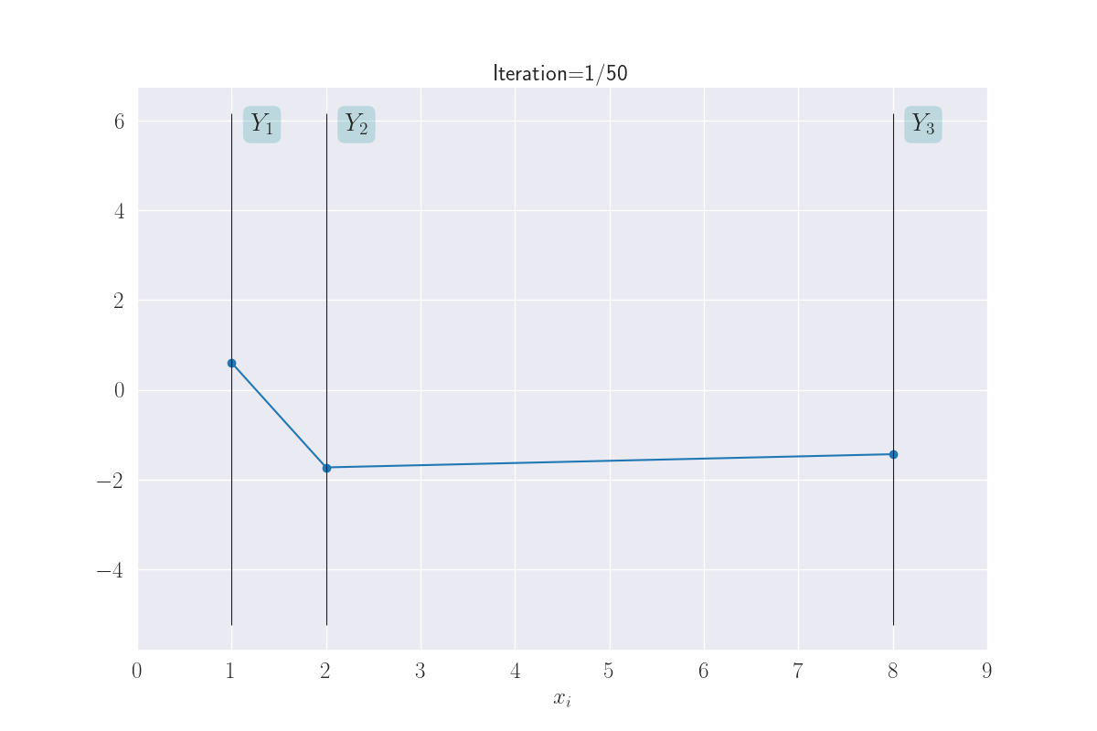
Visualization of three output distributions.
Note how \(Y_1\) and \(Y_2\) seem to take on similar values, while \(Y_1\) (or \(Y_2\)) and \(Y_3\) can end up with very different values. This is because of the large distance of \(x_3\) from \(x_1\) or \(x_2\).
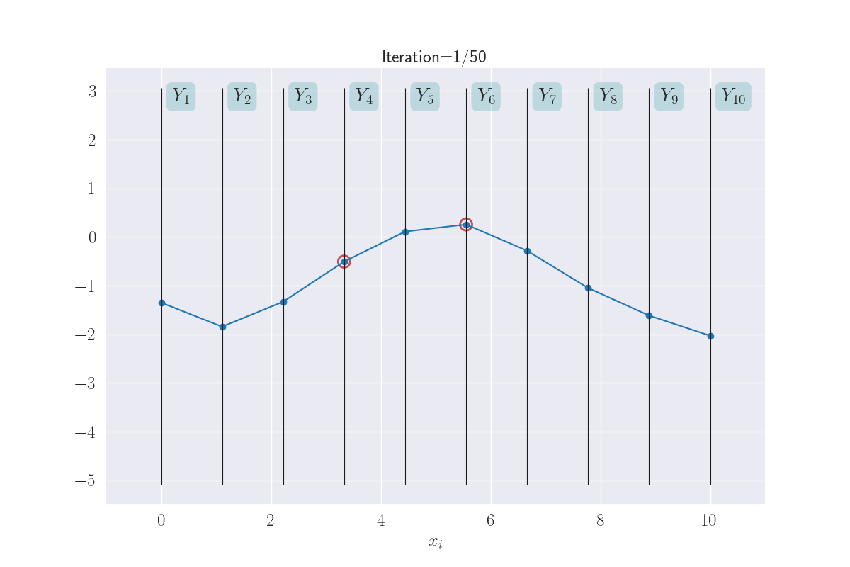
Just because now we can, lets go ahead and look at ten ouput distributions.
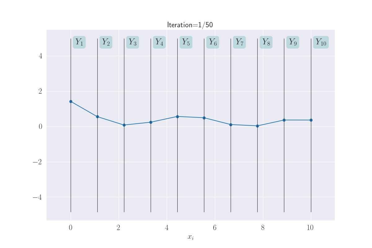
Visualization of ten output distributions.
This almost looks like a full-fledged function! Again, note how \(x_i\) that are close together, take on similar values. This makes the function appear smooth. What you are seeing here is a distribution of functions as modeled by a GP. Sounds complex, but what we are really saying is that each line through \(Y_1-Y_{10}\) is a function, and since we are seeing multiple functions above - because of the uncertainty of \(Y_i\)s - we are effectively looking at a distribution of functions.
Sticking with this visual metaphor, what does regression mean here? A training instance \((x_i, y_i)\) implies the corresponding variable \(Y_i\) is now fixed at the value of \(y_i\). Training data effectively clamps down the function at observations, leaving it to vary elsewhere. In the next plot, the clamped down points are shown in red.
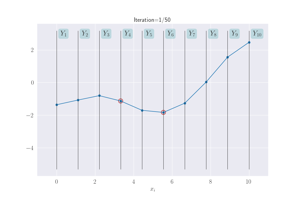
Training data clamps down the y values - shown with red circles.
How much does the function sway “elsewhere” - we’ll think of these as test locations - depends on (a) the degree/kind of smoothness we have enforced, and (b) how far a test input is from a training instance. In general, you might imagine that the effect of clamping reduces as you move away from the clamped points. There are exceptions to this, like if you wanted your smoothness to have some kind of periodicity (example) - but this is a good mental model for now.
The benefit to all this that when are predicting the output for an input, we end up predicting a distribution instead of a single value. This is not as scary as it sounds: consider any vertical \(Y_i\) bar in the above plot, and think about the animated line tracing values on it. Shown below.
The multiple values produced for each input are shown.
The distributions of these traced values are what we are looking for. And since we know them to be Gaussian, all we are looking for are their means and variances. In fact, we can visually see that these might be Gaussians (of course, we will confirm this in the next section). Here I have a drawn a KDE plot for the various \(Y_i\) values that begins to get plotted once we’ve had three iterations.
KDE plots over the various outputs - they start to approximate Gaussians as values accumulate. Not shown for the clamped points, since they are fixed values.
Yes, all of this is unusual, but also (I think) awesome. Intuitively, the few plots above convey the essence of GPs. What remains is to make these ideas rigorous, specifically, (a) which are the core assumptions and which are their consequences?, and (b) how do we effectively compute the quanities of interest?
IMPORTANT: we aren’t saying the outputs across inputs form an univariate Gaussian. Mathematically, this is what we ARE NOT saying:
\[Y \sim \mathcal{N}(\mu, \sigma^2)\]Where, \(Y\) is a random variable that takes on output values across different inputs, where we assume exactly one “best-guess” output for an input, i.e., for an \(x_i\), we just have one specific \(y_i\), and \(Y \in \{y_i\}_{i=1}^N\). Such a \(y_i\) is known as a point estimate. This is also why the \(y_i\)s are in lower case - they are not random variables. This is how regression models are commonly used: you plug in an input and receive an output. Instead of a covariance matrix \(\Sigma\), I am using the standard notation for variance \(\sigma^2\), since this is a 1D Gaussian.
So, what are we saying? We have one Gausian random variable dedicated to possible outputs for one input. Implicit in that statement is the fact that we are not doing point estimates anymore - we want to look at the range of outputs a single input might produce. We’ve decided to mathematically describe this range of outputs using an 1D Gaussian distribution.
If we have \(N\) inputs, now we have \(N\) 1D Gaussian distributions. The joint distribution of this collection of 1D Gaussians is a multivariate Gaussian, and it describes our current knowledge (or uncertainty) of the function. The extent of coupling (in this joint distribution) between individual distributions is decided by the similarity in their inputs. Simply put: if two inputs are highly similar, we’d expect their output 1D Gaussians to be similar too. Mathematically, this is what we ARE saying:
\[p(Y_1, Y_2, Y_3, ...) \sim \mathcal{N}(\mu, \Sigma)\]The precise coupling between the \(Y_i\) and \(Y_j\) Gaussian random variables is determined by the similarity in the respective inputs, \(\Sigma_{ij}=k(x_i, x_j)\).
Deep Dive
Let’s formalize all of this stuff. But fear not - there will be pictures!
We’ll talk about the following sets of points:
- Training data \((x_i, y_i)_{i=1}^N\).
- Test data or inputs where we want to evaluate the learned function: \(x_i^*, i=1 ... M\).
- All other points in the input space \(\tilde{x}_k\).
The corresponding uppercase letters would indicate a set of points, e.g., \(X\), \(X^*\), \(\tilde{X}\). This notation would be overloaded to imply matrices at times, e.g., \(X\in \mathbb{R}^{N\times d}\) where \(d\) is the number of dimensions of the data. The number of elements in \(\tilde{X}\) is potentially infinite. Also, as mentioned earlier, we want to talk about a range of outcomes for a particular input, and hence the outcomes would be denoted by random variables \(Y_i\), \(Y_i^*\) and \(\tilde{Y}_i\). We can obviously talk about specific values these random variables can take, e.g., \(Y_i=y_i\).
The model we’re proposing above is:
\[p(Y_1, ..., Y_N, Y_1^*, ..., Y_M^*, \tilde{Y}_1, ...) \sim \mathcal{N}(\mu, \Sigma)\]where \(\Sigma_{ij}=k(z_i, z_j)\), and each \(z\) comes from one of \(X\), \(X^*\) or \(\tilde{X}\), based on the positions \(i\) and \(j\).
NOTE:
- While the uppercase letters for inputs, e.g., \(X\), denote collections, uppercase indexed letters for the output denote individual random variables, e.g., \(Y_i\). Non-indexed uppercase letters denote a collection of random variables (analogous to the input), e.g., \(Y\), \(Y^*\), \(\tilde{Y}\).
- Many references explicitly mention the input as conditioning variables: \(p(Y_1, ..., Y_N, Y_1^*, ..., Y_M^*, \tilde{Y}_1, ...\vert {\color{WildStrawberry}{X}},{\color{WildStrawberry}{X^*}},{\color{WildStrawberry}{\tilde{X}}})\). But I’ll avoid it here to avoid clutter.
At this point, I can almost see this conversation between us:
- You: Whoa! Infinite points in \(\tilde{X}\)? How do we compute an infinite-dimensional distribution?
-
Me: We are only going to be dealing with \(X\) (training data) and \(X^*\) (test data) which are finite. I mentioned \(\tilde{X}\) to write down the overall model.
- You: Hmm, and what distribution do the finite parts follow?
- Me: Gaussian. Here’s why. Gaussian distributions have this interesting property that if you were to look at the variations in only a subset of the variables, then you’d see they also follow a Gaussian distribution (known as marginalization). By this property the finite parts of the original infinite-dimensional Gaussian are also a Gaussian. The parameters for this marginalized Gaussian are easy to obtain: only retain the subset of the original parameters that involve the current subset of variables. For example, if the random variables \(t_1, t_2, t_3, t_4\) follow a Gaussian distribution, then \([t_1, t_3]\) is a Gaussian with the parameters in this color.
- You: This helps us how?
-
Me: We can talk only about the train and test data as coming from a Gaussian. Yes, this can be seen as a marginalization of the “larger” infinite-dimensional Gaussian that conceptually exists. So, what we’ll really focus on is this distribution: \(p(Y_1, ..., Y_N, Y_1^*, ..., Y_M^*) \sim \mathcal{N}(\mu, \Sigma)\). You don’t see the inputs in this expression, but remember they’re hiding within the \(\Sigma\).
- You: I see. So we worry only about the train and test data. But how do derive the test outcomes given the training data? This regression problem is why we’re here after all.
-
Me: If you look at the expression above, we’re asking for the conditional distribution given training outcomes, i.e., \(p(Y_1^*, ..., Y_M^* \vert {\color{WildStrawberry}{Y_1=y_1}}, {\color{WildStrawberry}{Y_2=y_2}}, ..., {\color{WildStrawberry}{Y_N=y_N}})\). Guess what this conditional distribution is … yes, also a Gaussian. This has nothing to do with GPs; its a property of the Gaussian distribution that its conditionals are Gaussian as well. And its parameters are expressible in terms of \({\color{WildStrawberry}{X}}\), \({\color{WildStrawberry}{Y}}\), \({\color{WildStrawberry}{X^*}}\), \({\color{WildStrawberry}{\mu}}\) and \({\color{WildStrawberry}{\Sigma}}\) . This is it - this is the big reveal. The random variables corresponding to our test outputs are jointly Gaussian, whose parameters are calculable in closed form.
You can also calculate the distribution of just one \(Y_i^*\). No points for guessing what this distribution is: by the marginalization property this is a (univariate) Gaussian since \(p(Y_1^*,..., Y_M^*)\) is a Gaussian. With a distribution for \(Y_i^*\) we can now do the following:
- Calculate the mean value for \(Y_i\) - this serves as the regression value for input \(x_i\).
- Assign an uncertainty score to \(Y_i\), based on the flatness of its Gaussian.
NOTE:
That’s a lot of Gaussians! Quite a few operations on Gaussians result in Gaussians; which is why they’re considered to be mathematically convenient. You can develop tools and strategies for Gaussians alone, and that will take you far. But be careful here in distinguishing between these operations:
- We used marginalization to say that its OK to think about a finite slice of the overall model as a Gaussian. The convenient form of marginalization helped here: we could just parameterize this finite distribution in a self-contained manner, while assuming that these parameters were plucked out of an infinitely larger parameter space.
- Then, we used conditioning wrt training data, on this marginal finite Gaussian distribution, to describe the test outputs.
So, really, the central assumption here is that the output distributions are jointly Gaussian, with a covariance matrix that encodes input similarities. All other properties are consequences.
Hopefully, it starting to look like things are coming together. A few more details should seal the deal:
- We set \({\color{WildStrawberry}{\mu=0}}\). This is a convenient assumption but works well in practice because (we shall see soon) the conditional distribution we want is strongly influenced by the actual training data. If you’re interested, this discussion on StackExchange discusses the validity of such an assumption.
- Lets start referring to the covariance matrix as the kernel matrix \(K\) to emphasize that it consists of similarity values. \(k()\) itself is known as the kernel function. To rephrase something we saw earlier, \({\color{WildStrawberry}{K_{ij}}}=k(z_i, z_j)\), where \(z\) comes from one of \(X\), \(X^*\) or \(\tilde{X}\), based on the positions \(i\) and \(j\).
-
What is an example of a kernel function? A very common example is the Radial Basis Function (RBF) kernel \({\color{WildStrawberry}{k(z_i, z_j) = e^{-\vert\vert z_i-z_j \vert\vert^2/(2L^2)}}}\). If \(z_i\) and \(z_j\) are close, say, \({\color{WildStrawberry}{\vert\vert z_i-z_j \vert\vert \approx 0}}\), then we’ve \({\color{WildStrawberry}{k(z_i, z_j) \approx 1}}\) (for a given \(L\)). On the other hand, if \({\color{WildStrawberry}{\vert\vert z_i-z_j \vert\vert \to \infty}}\), then \({\color{WildStrawberry}{k(z_i, z_j) \to 0}}\). This is how we would expect similarities to behave. Here \({\color{WildStrawberry}{L}}\) is known as the length scale, and we’ll explain its role soon. Of course, there are many other kernels, but we’ll use the RBF kernel in our examples here. For others, this is a good reference.
Can any notion of similarity be written up as a kernel function? Good news bad news kind of situation. Unfortunately not - the matrix \(K\) needs to be positive semi-definite. This is a property we won’t delve into here. This is not particularly restrictive for these reasons: (a) there are many useful similarity functions that follow this property, and (b) you can use such valid kernel functions to compose new ones in certain ways that guarantee that the new kernel also possesses this property.
- We’ll think of \(K\) as being partitioned into four sections based on the data among which similarities are computed. For example, the partition \(K_{XX^*}\) implies this submatrix contains similarities between instances in \(X\) and \(X^*\). This is shown below.
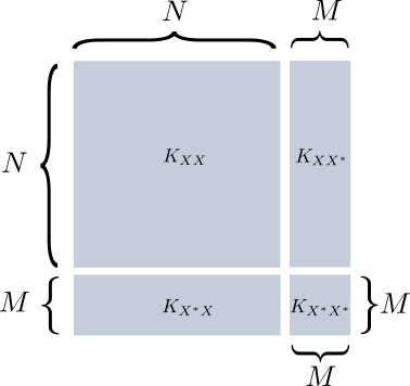
Partitioning of the kernel matrix.
Now we’re ready to write down the exact form of the test distributions: \(p(Y^*_1, ..., Y^*_M \vert Y_1, ..., Y_N) = \mathcal{N}({\color{WildStrawberry}{K_{X^*X} K^{-1}_{XX}y}}, {\color{PineGreen}{K_{X^*X^*} - K_{X^*X} K^{-1}_{XX} K_{XX^*} }} )\)
Here,
- The above expression is just the standard formula for the conditional distribution for a Gaussian.
- \(y\) is the vector of training outputs \([y_1, y_2, ..., y_N]\).
- The new mean is \({\color{WildStrawberry}{K_{X^*X} K^{-1}_{XX}y}}\). This is a \(M\)-dimensional vector, where the \(i^{th}\) value is the mean value for \(Y_i\). The different matrix sizes are visualized below.
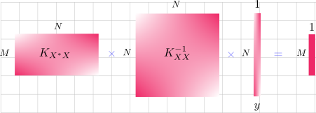
- The new covariance matrix is \({\color{PineGreen}{K_{X^*X^*} - K_{X^*X} K^{-1}_{XX} K_{XX^*} }}\).
These look complicated, but the important thing here is \(p(Y)\) can be computed in closed form! With just that equation. Think of what we’re getting - an entire joint distribution over outputs \(Y_1, Y_2,..., Y_N\).
Let’s visualize this in the syle we saw in the previous section. We sample once from the distribution \(p(Y^*_1, ..., Y^*_M \vert Y_1, ..., Y_N)\) for one realization of the learned function. You can sample multiple times to obtain different such realizations.
The image below shows this (zooming in recommended), given some training data and test input locations. It shows three realizations of \(p(Y)\). It also shows, in gory detail, what the kernel matrix looks like - note that its color coded to show interactions between \(X\) and \(X^*\).
The big picture: given evaluated (red) points and points where we want to plot (blue), what the overall matrix K looks like. Note the color coding in K: values created using the red and blue values are in purple.
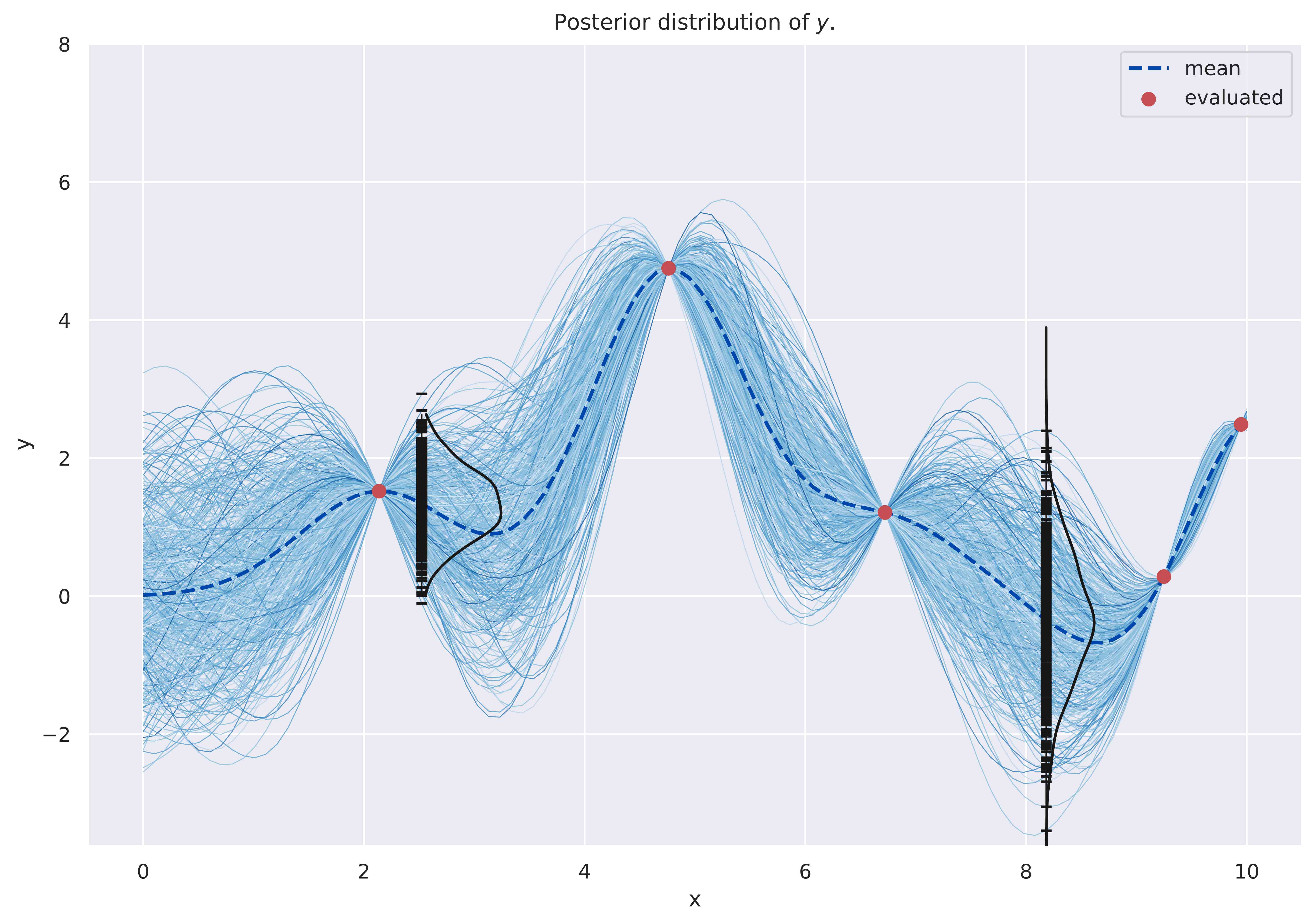
Since we’re effectively sampling realizations of the learned function, we conventionally say we’re “sampling functions”, and that the GP provides a distribution over functions (a phrasing we encountered earlier). There is nothing stopping us from having a lot of closely-spaced test inputs, plotting against which actually lends credence to that terminology. The image below shows this - we’ve a lot of test inputs in \([0, 10]\), which are not explicitly marked to avoid cluttering. The training data is shown in red dots. This time I have also plotted the mean output values for each \(Y_i\) and connected them with a dashed line - this acts like a standard regression curve.
Multiple sampled functions. Evaluated locations act like constrictions. We noted this earlier in the animations in the previous section.
Can we control for how smooth we want the functions to be? One way to do it would be pick an appropriate kernel. But even with an RBF kernel, you can exercise control using the length scale parameter \(L\). Think about the role it plays in \(k(z_i, z_j) = e^{-\vert\vert z_i-z_j \vert\vert^2/(2{\color{WildStrawberry}{L}}^2)}\). A large value suppresses the difference \(\vert\vert z_i-z_j \vert\vert^2\). This is to say, points that are both close and somewhat farther apart, would end up with similarity scores \(\approx 1\). Since this means the corresponding outputs should also be similar, such functions would seem less “bendy”, i.e., we won’t see drastic changes over short spans. The following images show the effect of changing the length scale (see the titles).
Effect of the length scale - shown increasing from top to bottom. Lower length scales lead to functions that can 'bend' more.
We noted above that the distribution for a single output random variable \(Y^*_i\) is also a Gaussian due to marginalization. Let’s plot KDEs here to see this; similar to an exercise we had done earlier. I have done this for a couple of locations below.
The empirical distribution of y shown as a KDE plot.
Since we know the parameters of these Gaussians, an alternative way to visualize them is to mark the points that are one standard deviation away from the mean, and connect these for different \(Y^*_i\). If we denote the distribution parameters at a given \(x^*_i\) as \(\mu_{x^*_i}\) and \(\sigma_{x^*_i}\), then we’re drawing curves through (1) \(\mu_{x^*_i}\), (2) \(\mu_{x^*_i} + \sigma_{x^*_i}\) and (3) \(\mu_{x^*_i} - \sigma_{x^*_i}\), as shown below. Indeed, this is the standard way of visualizing these distributions.
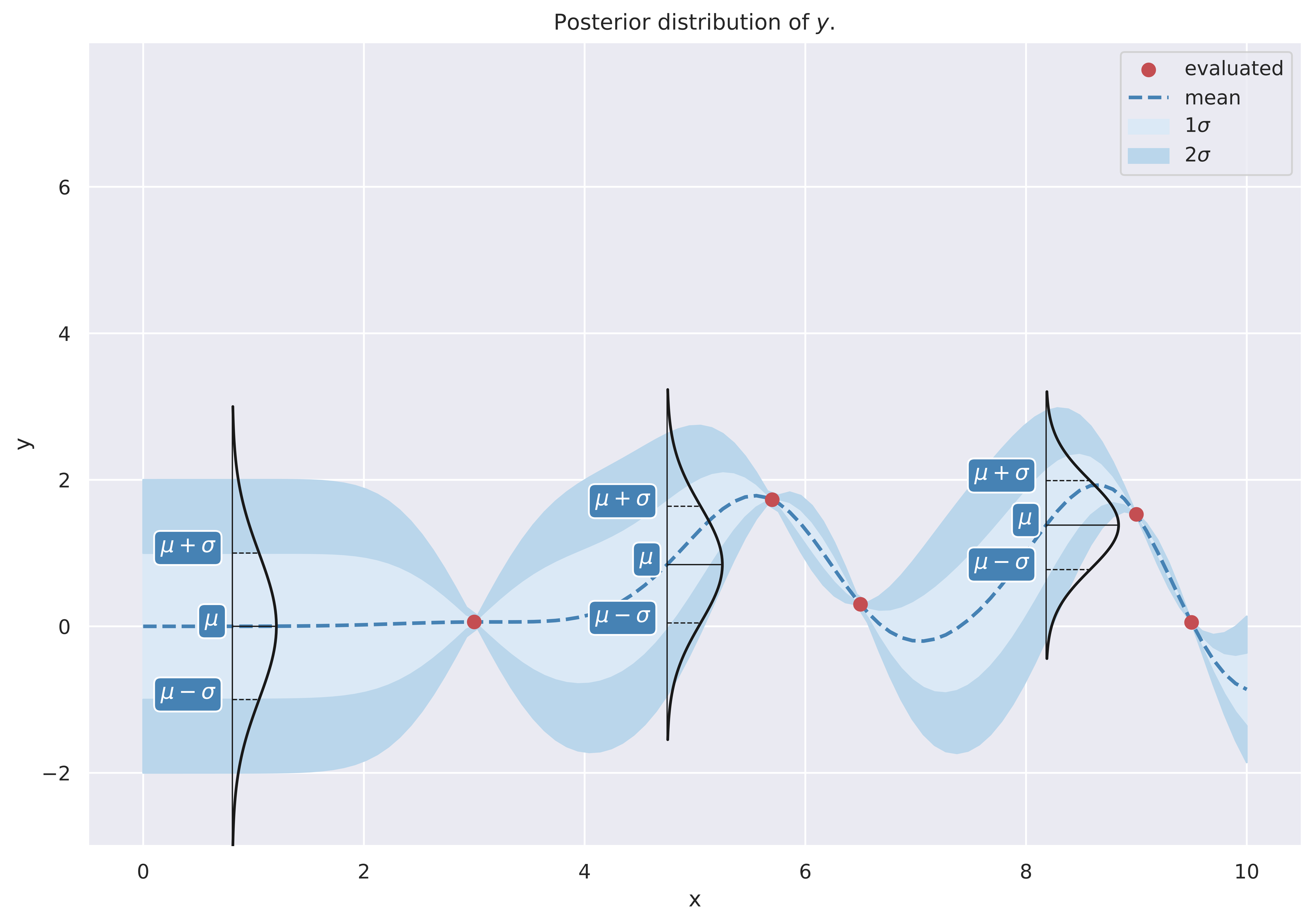
How the bands are drawn.
Of course, you can draw these bands for other multipliers of the standard deviation, e.g., \(\mu_{x^*_i} + 2\sigma_{x^*_i}\) and \(\mu_{x^*_i} - 2\sigma_{x^*_i}\). This is shown below.
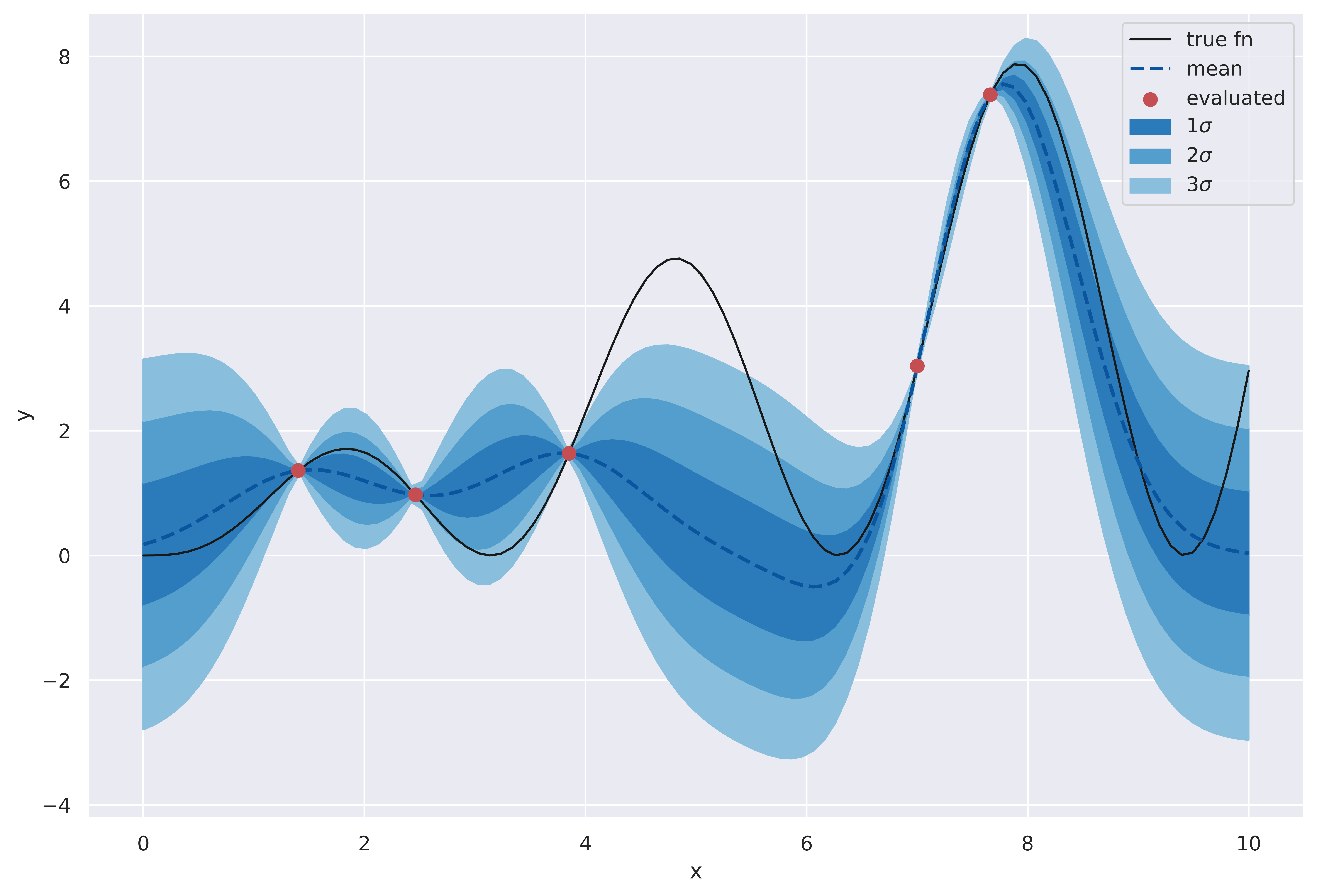
Bands representing values at different standard deviations are shown.
This wraps up the overview of GPs. We’ll dwell over it just a bit more before we move on.
Connection with Bayesian Linear Regression
In the previous section we motivated GPs by tying in our requirements with properties of the multivariate Gaussian. That might’ve seemed a bit out of the left field. But there is another way to look at GPs that is closer to familiar territory.
Consider Linear Regression for the case that we want to learn model parameters in a Bayesian fashion.
As before, let test data be \(X^* \in \mathbb{R}^{M \times d}\), \(Y^* \in \mathbb{R}^{M \times 1}\). Let train data be denoted by \(D\). We assume a linear model where \(y^*_i \sim \mathcal{N}(W_{[1...d]}x^*_i+W_0, \sigma^2)\). This denotes that \(y^*_i\) is almost linear in \(x_i\), i.e., \(y^*_i=W_{[1...d]}x^*_i\), but exhibits some perturbation or noise in the real world. This noisy linear relationship is concisely represented using a Normal distribution with a mean that linearly depends on \(x^*\) with variance \(\sigma^2\). Effectively, every \(y^*\) gets its own distribution centered at \(W_{[1...d]}x^*\), but the level of noise - captured by \(\sigma\) - is assumed fixed for the data. We also assume the prior over weights \(p(W)\) is Gaussian. Here \(W\) is a vector of all weights, i.e., \(W=[W_0 W_1 ... W_{d}]\).
If we write down the expression for \(p(Y^* \vert X^*, D)\), we’ll notice that it involves a bunch of Gaussians that combine together to finally simplify into a Gaussian. This is shown below.
\[\begin{aligned} p(Y^*|X^*, D)& = \int_W p(Y^*|X^*, W) p(W|D) dW \\ &= \underbrace{\int_W \overbrace{p(Y^*|X^*, W)}^{prod. \; of\; Gauss.} \overbrace{\frac{\overbrace{p(D|W)}^{prod. \; of\; Gauss.\leftarrow i.i.d.} \times \overbrace{p(W)}^{Gaussian\; prior}}{Z}}^{Gaussian \leftarrow prod. \; of\; Gauss.} dW}_{Gaussian \leftarrow marginalization \; of\; a\; Gaussian} \end{aligned}\]Here:
-
\(p(D \vert W)\) is a product of Gaussians because we assume the data to be independent and identically distributed (iid). Which is to say \(p(D \vert W) = \prod^N_{i=1} p(y_i \vert x_i, W)\). This results in a joint Gaussian distribution over \(Y_1, Y_2, ..., Y_N\). For the same reason, \(p(Y^* \vert X^*, W)\) is a Gaussian.
-
\(Z\) is a normalizing factor. We don’t require its exact value here.
What we’re eventually saying above is that the output distribution is jointly Gaussian, much like the GP. And very similar to an earlier plot, we can visually guess this might be true. In the following plot, I draw a bunch of lines, whose parameters - slope \({\color{WildStrawberry}{m}}\;(=W_1)\) and intercept \({\color{WildStrawberry}{c}}\;(=W_0)\) - are sampled from a Gaussian. For each of these lines, if I now determine the value of \(y^*_i=mx^*_i+c\) (this is equivalent to sampling from \(\mathcal{N}(mx^*_i+c, \sigma^2)\), where we have set \(\sigma=0\) for convenience), and show their spread using a KDE plot (shown only for some arbitrarily-picked locations), this is what we get:
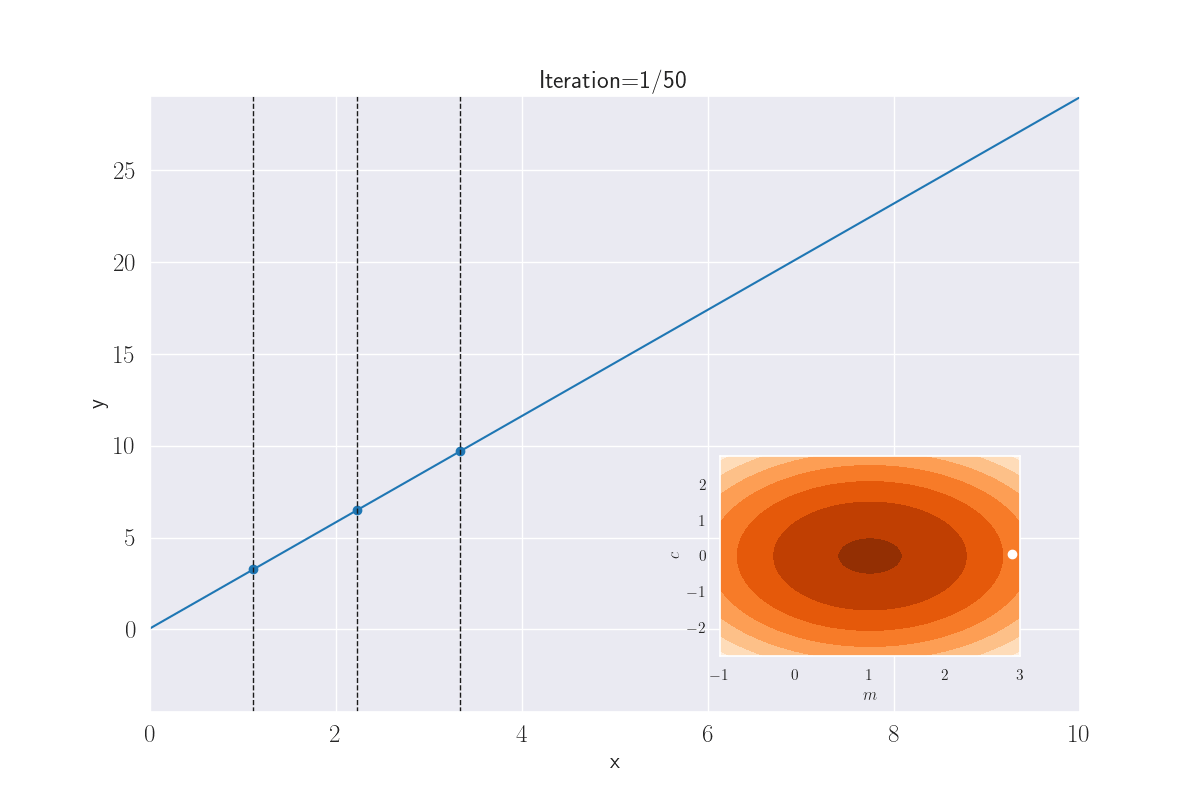
Distribution of outputs at given locations for various lines. The slopes and intercepts come from a bivariate Gaussian - shown in the inset image. A white dot that appears corresponds to the parameters - slope and intercept - of the current line.
It looks like the marginal output distributions per \(i\) are Gaussians, which is what we would expect from the joint begin Gaussian. We have seen this before! Let’s bring up that plot.
A plot we have seen earlier. Use of GPs to learn a general function. The outputs for a given input are Gaussian.
See how close this is to Linear Regression case? But this is better because the function doesn’t have to be linear. In a way, GPs “cut out the middleman” from the linear model, by replacing whatever covariances the linear model leads to, with an arbitrarily expressive kernel matrix.
Minimal Code for GP
GPs are conceptually unusual, but getting some code up and running is surprisingly easy. This is because the output distribution comes from just one equation. I’ll use the RBF kernel implementation in sklearn.metrics.pairwise.rbf_kernel. If we don’t worry about learning the length scale, and use the default, the following code is all you need for a functional GP.
import numpy as np
from sklearn.metrics.pairwise import rbf_kernel as rbf
from scipy.stats import multivariate_normal as mvn


def gp_predict(X_train, y_train, X_test, num_sample_functions=10,
               return_params=False):

    # calculate the various partitions
    K_x_x = rbf(X_train, X_train)
    K_x_x_star = rbf(X_train, X_test)
    K_x_star_x = K_x_x_star.T
    K_x_star_x_star = rbf(X_test, X_test)

    # calculate the mean and cov. for the joint output distribution
    mean = K_x_star_x @ np.linalg.inv(K_x_x) @ y_train.reshape((-1, 1))
    mean = mean.flatten()
    cov = K_x_star_x_star - K_x_star_x @ np.linalg.inv(K_x_x) @ K_x_x_star

    # sample some functions
    # y_star is an array of size num_sample_functions x M
    y_star = mvn.rvs(mean=mean, cov=cov, size=num_sample_functions)

    # That's it folks!
    if return_params:
        return y_star, mean, cov
    else:
        return y_star
This is it. Really. The above code is training, prediction and prediction probabilities all rolled into one.
Something to note here is that because of practical issues with numerical stability, such as those that might arise in calculating the covariance matrix, an alternative is to sample from the standard Normal (one with zero mean and unit variance) and adjust the output later (for an example, see how the Cholesky decomposition is used here).
Do we want to take it out for a spin? Of course we do! Let’s generate some data on a sine curve, and sample some functions.
# NOTE: please ensure previous imports and the gp_predict() function
# are available to this code!

from matplotlib import pyplot as plt

num_train, num_test = 5, 100

X_train = np.linspace(0, 2*np.pi, num_train)
y_train = np.sin(X_train)
X_test = np.linspace(0, 2*np.pi, num_test)

# we need to reshape the arrays since 2D inputs are expected
multiple_y_star = gp_predict(X_train.reshape(-1, 1), y_train,
                             X_test.reshape(-1, 1),
                             num_sample_functions=10)

# let's plot the sampled outputs
for idx, y in enumerate(multiple_y_star):
    plt.plot(X_test, y, linewidth=0.75, label=f"f_{idx+1}")

# let's also show the training data using a scatter plot
plt.scatter(X_train, y_train, c='k', s=100, label='train')

# let's now plot the true test function
plt.plot(X_test, np.sin(X_test), linewidth=2, c='k', label="true fn")

plt.legend()
plt.xlabel('x'); plt.ylabel('y')
plt.show()
This is what we obtain:
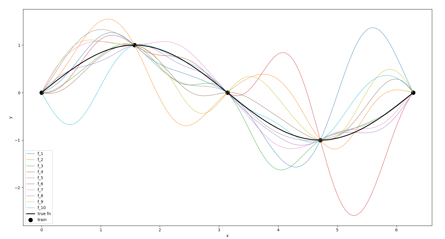
Output from the above codes.
Think of another model thats this concise but that affords us the same expressivity as a GP - both in terms of the complexity of functions it can fit, and uncertainty quantification. I can think of k-Nearest Neighbors and Linear Regression as candidates for conciseness, but these are limited in their expressivity.
Summary and Challenges
We are finally at the end of our whirlwind tour of GPs. I think of them as a neat way to fit complex models and obtain uncertainty quantification. They can also model noise in the observed data - something we haven’t covered here. And they’re concise. So, why haven’t they taken over the world? A big problem is their runtime.
Note that GPs don’t really have a training phase (at least that’s we’ll assume here, but in practice, we do need to learn parameters such as the length scale) and keep around all the training data for test-time predictions. Unfortunately the volume of this data comes into play as expensive matrix operations at test-time. Recall these final parameters:
- Mean: \(K_{X^*X} {\color{WildStrawberry}{K^{-1}_{XX}}}y\)
- Covariance: \(K_{X^*X^*} - K_{X^*X} {\color{WildStrawberry}{K^{-1}_{XX}}} K_{XX^*}\)
The inversion is probably the biggest culprit, since its runtime complexity is \(O(n^3)\). You could make this a little faster (and numerically stable) using the Cholesky decomposition (Algorithm 2.1 here); this reduces the constant factors in the runtime, is numerically stable, but is still \(O(n^3)\). You might precompute \(K^{-1}_{XX}\) - but you’ll still need to keep the training data around (for \(K_{X^*X}\) - so this is memory intensive) and, while the compute would then be lower, its now \(O(n^2)\), which still is expensive for large training datasets.
As an aside, this is why GPs are non-parametric models. Contrast this with parametric models like Logistic Regression, where we distill (and then discard) the training data into a few parameters for use at test-time.
There has been lots of work on speeding up GPs, e.g., by using inducing points, which are a small set of training points that produce approximately the same results as the entire data (Wilson & Nickisch, 2015; Snelson & Ghahramani, 2005). On a more pragmatic note though, the notion of what’s a “large” model wrt memory and compute has been challenged in the past few years, by Deep Learning, and specifically by generative models like LLMs. It would make sense to evaluate GPs for a task given the actual practical constraints at hand.
I’ve listed some learning resources in the sequel post here.
We looked at one critical ingredient of BayesOpt here - surrogate models. We’ll discuss the other critical component - acquisition functions - in the next post. That also contains a list of learning resources at the end. See you there!
References
- Turner, R., Eriksson, D., McCourt, M., Kiili, J., Laaksonen, E., Xu, Z., & Guyon, I. (2021). Bayesian Optimization is Superior to Random Search for Machine Learning Hyperparameter Tuning: Analysis of the Black-Box Optimization Challenge 2020. In H. J. Escalante & K. Hofmann (Eds.), Proceedings of the NeurIPS 2020 Competition and Demonstration Track (Vol. 133, pp. 3–26). PMLR. https://proceedings.mlr.press/v133/turner21a.html
- White, C., Neiswanger, W., & Savani, Y. (2021). BANANAS: Bayesian Optimization with Neural Architectures for Neural Architecture Search. Proceedings of the AAAI Conference on Artificial Intelligence.
- Opsahl-Ong, K., Ryan, M. J., Purtell, J., Broman, D., Potts, C., Zaharia, M., & Khattab, O. (2024). Optimizing Instructions and Demonstrations for Multi-Stage Language Model Programs. In Y. Al-Onaizan, M. Bansal, & Y.-N. Chen (Eds.), Proceedings of the 2024 Conference on Empirical Methods in Natural Language Processing (pp. 9340–9366). Association for Computational Linguistics. https://doi.org/10.18653/v1/2024.emnlp-main.525
- Gómez-Bombarelli, R., Wei, J. N., Duvenaud, D., Hernández-Lobato, J. M., Sánchez-Lengeling, B., Sheberla, D., Aguilera-Iparraguirre, J., Hirzel, T. D., Adams, R. P., & Aspuru-Guzik, A. (2018). Automatic Chemical Design Using a Data-Driven Continuous Representation of Molecules. ACS Central Science, 4(2), 268–276. https://doi.org/10.1021/acscentsci.7b00572
- Boelrijk, J., Ensing, B., Forré, P., & Pirok, B. W. J. (2023). Closed-loop automatic gradient design for liquid chromatography using Bayesian optimization. Analytica Chimica Acta, 1242, 340789. https://doi.org/https://doi.org/10.1016/j.aca.2023.340789
- Ament, S., Witte, A., Garg, N., & Kusuma, J. (2023). Sustainable Concrete via Bayesian Optimization.
- Mehta, V., Paria, B., Schneider, J., Neiswanger, W., & Ermon, S. (2022). An Experimental Design Perspective on Model-Based Reinforcement Learning. International Conference on Learning Representations. https://openreview.net/forum?id=0no8Motr-zO
- Kirschner, J., Nonnenmacher, M., Mutný, M., Krause, A., Hiller, N., Ischebeck, R., & Adelmann, A. (2019-11). Bayesian Optimisation for Fast and Safe Parameter Tuning of SwissFEL [Conference Paper]. In W. Decking, H. Sinn, G. Geloni, S. Schreiber, M. Marx, & V. R. W. Schaa (Eds.), FEL2019, Proceedings of the 39th International Free-Electron Laser Conference (pp. 707–710). JACoW Publishing. https://doi.org/10.3929/ethz-b-000385955
- Ghose, A., & Ravindran, B. (2020). Interpretability With Accurate Small Models. Frontiers in Artificial Intelligence, 3, 3. https://doi.org/10.3389/frai.2020.00003
- Ghose, A., & Ravindran, B. (2019). Learning Interpretable Models Using an Oracle. CoRR, abs/1906.06852. http://arxiv.org/abs/1906.06852
- Nguyen, E. T., & Ghose, A. (2023). Are Good Explainers Secretly Human-in-the-Loop Active Learners? AI&HCI Workshop at the 40th International Conference on Machine Learning,
ICML. https://arxiv.org/abs/2306.13935
-
- Schneider, L., Wistuba, M., Klein, A., Golebiowski, J., Zappella, G., & Merra, F. A. (2025). Hyperband-based Bayesian Optimization for Black-box Prompt Selection. Forty-Second International Conference on Machine Learning. https://openreview.net/forum?id=Lm9DXFrcHD
- Neiswanger, W., Wang, K. A., & Ermon, S. (2021). Bayesian Algorithm Execution: Estimating Computable Properties of Black-box Functions Using Mutual Information. In M. Meila & T. Zhang (Eds.), Proceedings of the 38th International Conference on Machine Learning (Vol. 139, pp. 8005–8015). PMLR. https://proceedings.mlr.press/v139/neiswanger21a.html
- Astudillo, R., & Frazier, P. I. (2022). Thinking inside the box: A tutorial on grey-box Bayesian optimization.
- Bergstra, J., Bardenet, R., Bengio, Y., & Kégl, B. (2011). Algorithms for Hyper-parameter Optimization. Proceedings of the 24th International Conference on Neural Information Processing Systems, 2546–2554. http://dl.acm.org/citation.cfm?id=2986459.2986743
- Makarova, A., Shen, H., Perrone, V., Klein, A., Faddoul, J. B., Krause, A., Seeger, M., & Archambeau, C. (2022). Automatic Termination for Hyperparameter Optimization. First Conference on Automated Machine Learning (Main Track).
- Wang, Z., Shakibi, B., Jin, L., & Freitas, N. (2014). Bayesian Multi-Scale Optimistic Optimization. In S. Kaski & J. Corander (Eds.), Proceedings of the Seventeenth International Conference on Artificial Intelligence and Statistics (Vol. 33, pp. 1005–1014). PMLR. https://proceedings.mlr.press/v33/wang14d.html
- Kim, J., & Choi, S. (2022). On Uncertainty Estimation by Tree-based Surrogate Models in Sequential Model-based Optimization . In G. Camps-Valls, F. J. R. Ruiz, & I. Valera (Eds.), Proceedings of The 25th International Conference on Artificial Intelligence and Statistics (Vol. 151, pp. 4359–4375). PMLR. https://proceedings.mlr.press/v151/kim22b.html
- Snoek, J., Rippel, O., Swersky, K., Kiros, R., Satish, N., Sundaram, N., Patwary, M., Prabhat, M., & Adams, R. (2015). Scalable Bayesian Optimization Using Deep Neural Networks. In F. Bach & D. Blei (Eds.), Proceedings of the 32nd International Conference on Machine Learning (Vol. 37, pp. 2171–2180). PMLR. https://proceedings.mlr.press/v37/snoek15.html
- Wilson, A., & Nickisch, H. (2015). Kernel Interpolation for Scalable Structured Gaussian Processes (KISS-GP). In F. Bach & D. Blei (Eds.), Proceedings of the 32nd International Conference on Machine Learning (Vol. 37, pp. 1775–1784). PMLR. https://proceedings.mlr.press/v37/wilson15.html
- Snelson, E., & Ghahramani, Z. (2005). Sparse Gaussian Processes using Pseudo-inputs. In Y. Weiss, B. Schölkopf, & J. Platt (Eds.), Advances in Neural Information Processing Systems (Vol. 18). MIT Press. https://proceedings.neurips.cc/paper/2005/file/4491777b1aa8b5b32c2e8666dbe1a495-Paper.pdf